When we talk about optimizing the user experience, what we’re really talking about is getting rid of all the little frustrations that make a website hard to use. It’s a systematic process of smoothing out the rough edges—improving site speed, simplifying navigation, ensuring it works flawlessly on a phone, and making sure the content is crystal clear. For any business, it’s about plugging the leaks in your revenue bucket.
Why User Experience Is Your Most Valuable Asset

Think of all the money you spend on ads, content, and social media. Each dollar is like pouring water into a bucket, hoping to fill it up with leads and sales. But if that bucket is full of holes, you’re just wasting resources. A bad user experience (UX) is what pokes those holes in your funnel.
Every single point of friction—a page that takes forever to load, a menu that makes no sense, a form you can’t fill out on your phone—gives a potential customer a reason to leave. This isn’t just some abstract design problem; it’s a direct hit to your bottom line. The data doesn’t lie: a smooth experience isn’t a “nice-to-have,” it’s a core driver of growth. In fact, studies show that every dollar invested in UX can bring back up to $100 in return.
From Fuzzy Concept to Hard Costs
It’s easy to write off UX as something fluffy, but the costs of ignoring it are very real. When a potential lead can’t find your pricing page or gets stonewalled by a broken contact form, they don’t patiently wait for you to fix it. They hit the back button and head straight to your competitor.
These aren’t hypothetical scenarios. They happen every single day and cost businesses real money. Consider these common culprits:
- Slow Load Times: A delay of just one second can slash your conversions by 7%. If you’re an e-commerce site doing $100,000 a day, that’s a staggering $2.5 million loss over a year.
- Poor Mobile Experience: Over 60% of all web traffic now comes from mobile devices. If your site is a pain to use on a smartphone, you’re essentially slamming the door on the majority of your visitors.
- Confusing Navigation: If people can’t figure out how to get where they want to go, they won’t. It’s that simple. This translates directly to high bounce rates and abandoned shopping carts.
Optimizing user experience isn’t about chasing some mythical “perfect” design. It’s about finding the biggest, most obvious leaks in your sales process and plugging them with practical, high-impact fixes.
The Power of a Practical UX Audit
The great thing is, you don’t need a massive budget or a full-time design team to start seeing results. The first, most important step is a practical UX audit—a focused review of your site’s performance, mobile usability, and navigation. This process helps you pinpoint the most critical issues that are actively costing you business right now.
In this guide, we’ll walk through exactly how to find and fix these common problems. By making small, strategic changes, you can turn your existing website traffic from a missed opportunity into a reliable stream of qualified leads and real business growth.
Your First Foundational UX Audit: Finding the Big Wins
You don’t need a team of designers or a massive budget to start improving your website’s experience. A solid UX audit is really just a structured way of seeing your site through your visitors’ eyes to spot the most glaring problems. We’re not hunting for every tiny imperfection here. The goal is to find the high-impact issues that are actively costing you leads.
This first pass is all about triage. We’ll focus on three core areas that make or break a user’s decision to stick around or bounce.
The Three Pillars of a Healthy Website Experience
Think of these as the legs on a stool. If one is wobbly, the entire experience feels unstable and untrustworthy. Your audit will check the health of each one.
- Site Performance: How fast does your site feel? Sluggish, slow-loading pages are conversion killers. Even a one-second delay can torpedo your conversion rates.
- Mobile Usability: How does your site actually work on a phone? With over 60% of all web traffic coming from mobile, a clunky mobile site isn’t just an annoyance—it’s a critical business failure.
- Navigation Clarity: Can people find what they’re looking for, fast? Confusing menus and dead-end pages are a direct path to frustration and a closed tab.
Imagine a local roofing company. A homeowner lands on their site looking for “emergency leak repair.” If the page takes five seconds to load, the “call now” button is too small to tap on a phone, and the services page is buried under a vague “What We Do” menu item, that potential customer is gone. This exact scenario plays out every single day, quietly draining a company’s lead funnel.
Getting Started with the Right (and Free) Tools
You already have what you need to get started. We’ll use a couple of free, easy-to-use tools to get some hard data on your site’s performance.
First, pop your URL into Google’s PageSpeed Insights. It spits out a ton of technical info, but don’t get lost in the weeds. Just focus on the main score for mobile and desktop and the big “opportunities” it flags at the top. Things like “properly size images” or “reduce unused JavaScript” are your first big clues.
Next, just use your own web browser. Open your website, right-click anywhere, and hit “Inspect.” This opens up the developer tools. Find the little icon that looks like a phone and tablet—clicking it lets you see exactly how your site renders on an iPhone, a Samsung Galaxy, or other common devices.
The most powerful audit tool is simple empathy. Put yourself in your customer’s shoes and try to do something meaningful on your site, like find a phone number or request a quote. Every time you hesitate or feel confused, you’ve found a problem worth fixing.
The Walk-Through: Finding Flaws First-Hand
With your tools ready, it’s time to become a secret shopper on your own site. Pretend you’ve never seen it before. Your mission: complete one critical task, like filling out a contact form to ask for a price.
As you go through this process on both your computer and your phone, ask yourself these questions:
- First Impression: Did the page load instantly? Do I know what this company does and who it’s for within three seconds?
- Finding My Way: Can I find the “Services” or “Contact” page without thinking too hard? Are the menu labels clear and simple (e.g., “Our Work” instead of “Portfolio Synergy”)?
- Mobile Interaction: Are the buttons big enough for my thumb to tap easily? Do I have to pinch and zoom to read anything? Is the form a nightmare of tiny fields and endless scrolling?
Jot down every single roadblock. A photo gallery that spins forever, a menu that vanishes on your phone, a button that’s nearly impossible to spot—these aren’t just small annoyances. They are leaks in your sales pipeline.
By spotting them, you’ve already taken the most important step. Of course, knowing what they’re doing is only half the battle. You also need to understand who these users are. Exploring different website visitor tracking tools can give you a much clearer picture of their entire journey.
You’ve done the hard work of auditing your website and now you have a laundry list of issues. Think of these as digital potholes and broken signs on your customer’s journey. Now comes the fun part: fixing the friction points that are actively killing your lead generation.
Don’t panic—this isn’t about a complete overhaul. The goal is to make smart, targeted fixes where they matter most. By implementing proven strategies to increase website conversions, you can smooth out the path from a curious visitor to a qualified lead.
The infographic below really nails down the core pillars of a solid user experience. These are the areas where friction loves to hide.
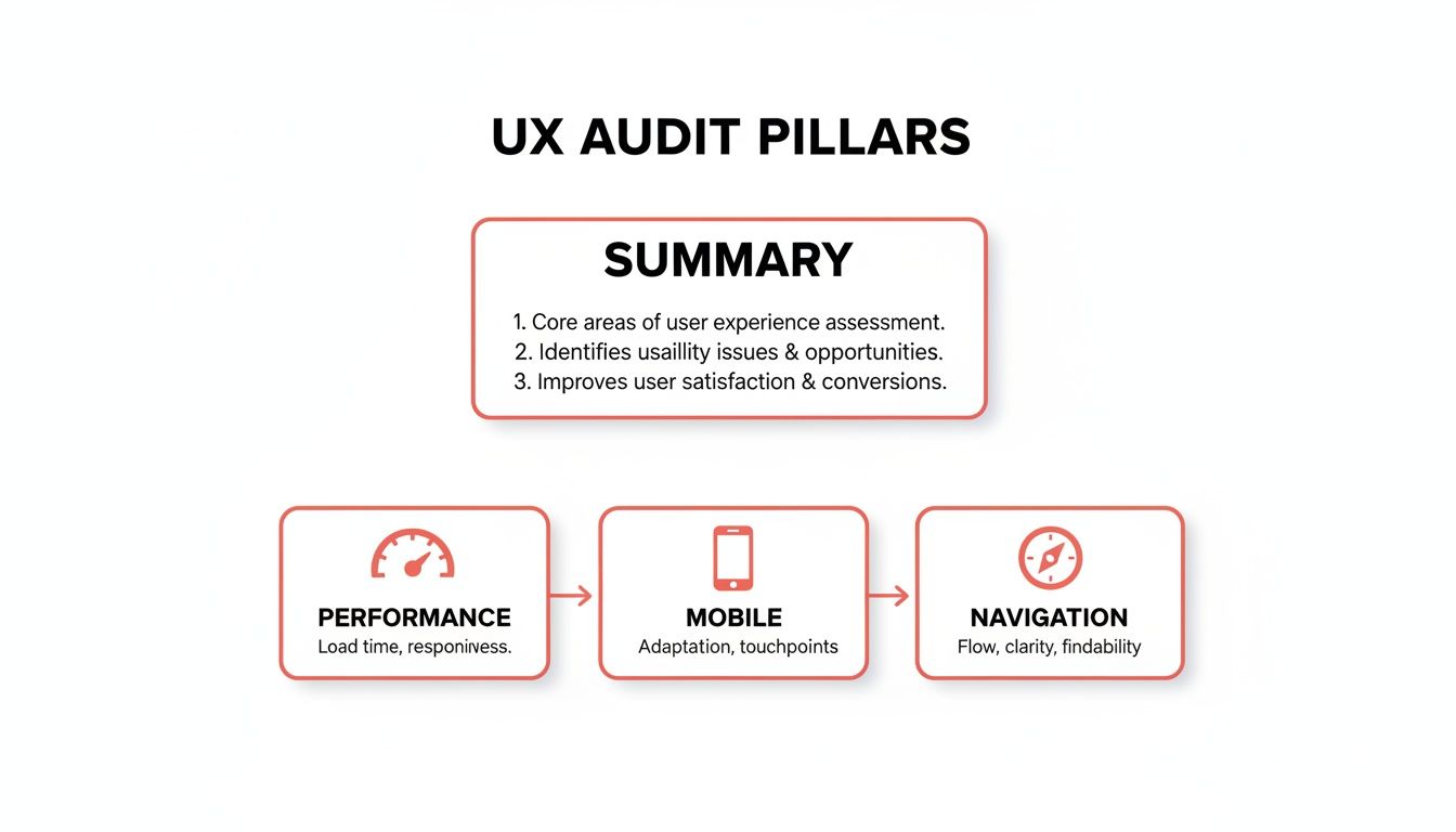
As you can see, a great user experience rests on a foundation of solid performance, a mobile-first design, and crystal-clear navigation. A crack in any one of these can make the whole structure crumble.
Tackling Performance Bottlenecks
Let’s be honest: slow websites are conversion killers. They don’t just annoy visitors; they send them packing. A page that takes more than a few seconds to load is practically invisible.
The good news? Some of the biggest speed boosts come from surprisingly simple changes.
Start with your images. I’ve seen countless sites brought to their knees by massive, unoptimized photos.
- Compress Your Images: Use a tool like TinyPNG to shrink file sizes without any noticeable loss in quality. It’s a game-changer.
- Enable Browser Caching: This tells a visitor’s browser to save static elements like your logo and CSS files. When they return, the page loads almost instantly because their browser already has most of the assets.
- Cut Down on Server Requests: Every single element on your page—images, scripts, fonts—is a separate request. Consolidating files and ditching unnecessary plugins can dramatically reduce these requests and speed everything up.
Winning on Mobile Is Non-Negotiable
A bad mobile experience isn’t just a minor issue anymore; it’s a massive business liability. Imagine spending your marketing budget driving traffic to your site, only to have 88% of mobile users give up because it’s unusable on their phone. That’s not a hypothetical—that’s the reality.
With mobile traffic now making up over 60% of all website visits, you simply can’t afford to get this wrong.
The key is to think “thumb-first.” Every design choice should be made with a small screen in mind.
- Thumb-Friendly Design: Make sure your buttons and links are big enough to tap easily. Nothing is more frustrating than hitting the wrong link because they’re all crammed together.
- Simplify Your Forms: Nobody wants to fill out a 12-field form on a tiny keyboard. Strip your forms down to the absolute essentials. Often, a name and email are all you need to start the conversation.
- Go Vertical: Design your content to flow in a single, easy-to-scroll column. Horizontal scrolling is a cardinal sin in mobile design.
Making the right UX choices is about prioritizing what truly moves the needle for your users. The table below highlights some of the high-impact fixes you should focus on, contrasted with common mistakes I see businesses make all the time.
High-Impact UX Fixes vs Common Mistakes
| Area of Focus | High-Impact Fix (What to Do) | Common Mistake (What to Avoid) |
|---|---|---|
| Site Performance | Compress all images and enable browser caching for a massive speed boost. | Uploading full-resolution images directly from a camera, slowing down every page. |
| Mobile Experience | Design with large, easily tappable buttons and simplified, thumb-friendly forms. | Using a desktop layout that forces users to pinch, zoom, and struggle to navigate. |
| Lead Capture | Implement an interactive, 24/7 AI chat to engage and pre-qualify visitors instantly. | Relying solely on a passive, multi-field “Contact Us” form that creates friction. |
| Navigation | Use clear, simple menu labels that instantly tell users what to expect (e.g., “Services,” “Pricing”). | Creating clever or vague menu names (e.g., “Our Philosophy,” “Solutions”) that confuse users. |
Focusing on these high-impact areas delivers immediate value and prevents you from getting bogged down in minor tweaks that don’t actually improve the user journey.
Transforming the Lead Capture Experience
This brings us to the final, and arguably most critical, friction point: the lead capture process itself.
For decades, we’ve relied on the static contact form. But let’s face it—it’s a high-effort, low-reward tool that puts a huge wall between you and a potential customer. It’s passive, impersonal, and forces the user to do all the work with zero immediate payoff.
This is where a modern tool like LeadBlaze completely changes the game. Instead of that boring old form, an AI sales assistant greets your visitors instantly, 24/7. It engages them in an actual conversation.
It can answer their basic questions, point them to the right information, and most importantly, ask the qualifying questions you need answers to. This transforms a chore into a genuinely helpful interaction. You’re not just capturing a lead anymore; you’re starting a pre-qualified conversation, delivering a warm, context-rich inquiry straight to your team instead of just another cold, anonymous form submission.
Let AI Proactively Engage Your Visitors

Fixing what’s broken on your site is one thing, but what if you could help visitors before they even get stuck? A great website shouldn’t just be a passive brochure. It needs to be an active guide, steering users toward the solutions they’re looking for and turning your site into a powerful sales tool.
This is where AI completely changes the game. By adding an intelligent assistant to your site, you can answer questions, handle objections, and qualify leads in real-time, around the clock. This kind of proactive support stops frustration dead in its tracks and creates a much smoother journey for every single person who lands on your page.
Go Beyond Basic, Scripted Chatbots
We’ve all dealt with those clunky, old-school chatbots. They’re rigid, rely on pre-programmed scripts, and often lead to dead ends and frustrated users. An AI sales assistant like LeadBlaze is a different beast entirely.
Instead of being stuck with a few canned responses, it learns directly from your website content—your service pages, FAQs, and even your blog posts. This means it can give instant, accurate answers to a huge range of visitor questions, from simple queries to more complex technical details. It’s the difference between talking to a helpful expert and getting stuck in a frustrating automated phone menu. If you want to dive deeper into this, our guide on how to make a chatbot breaks down the evolution from basic bots to truly intelligent assistants.
This is a bigger deal than you might think. A shocking 43% of organizations still don’t have established processes for making UX decisions based on user feedback. Worse, only 13% have a C-suite leader dedicated to UX. This gap is a massive opportunity for businesses that adopt proactive tools, turning their websites into lead-generation engines that leave the competition in the dust. You can explore more of these stats and discover key industry findings on uxcam.com.
What Proactive AI Looks Like in the Real World
Let’s make this concrete. Imagine a law firm’s website. A potential client lands on the site after business hours, worried and unsure if their specific case is a good fit.
- Without AI: They poke around the site, find a generic contact form, and send a message into the void, hoping for a call back the next day. In the meantime, they’ll probably keep searching and find a competitor.
- With LeadBlaze: The AI assistant greets them instantly. It asks about their legal issue and uses custom qualification rules to see if it’s a case type the firm handles. It can then gather key details and even offer to schedule a consultation, turning a passive visitor into a pre-qualified lead on the spot.
Or think about a software company. A developer hits a snag with a technical question late at night. Instead of waiting for the support team to come online, they can ask the AI assistant, which pulls the answer directly from the company’s knowledge base. This doesn’t just solve their problem; it builds trust and shows off your excellent customer support.
A proactive AI assistant doesn’t just answer questions—it anticipates needs. It turns moments of potential frustration into opportunities for engagement, qualification, and conversion.
Save Time, Improve the Experience
This proactive approach is a win-win. Your users get a better, more helpful experience, and you get incredible efficiency. Instead of your team having to read through long, messy chat transcripts, an AI assistant like LeadBlaze delivers concise, AI-generated lead summaries.
These summaries cut right to the chase, highlighting the visitor’s needs, their qualifying details, and their most important questions. This lets your team follow up with full context, ready to have a meaningful conversation. By setting your own custom qualification rules, you ensure the AI focuses only on what matters to your sales process. You’ll save a ton of time and get to focus on closing deals, not just collecting names and emails.
How to Measure Your UX Improvements
So you’ve smoothed out those friction points on your website. That’s a fantastic start, but don’t pop the champagne just yet. Improving user experience isn’t a one-and-done project; it’s a cycle. You have to know if your changes are actually moving the needle.
Without data, you’re flying blind.
Tracking the right numbers is the only way to know what’s working, what’s falling flat, and where you should focus next. It’s how you turn UX from a fuzzy concept into a hard science, proving that your hard work translates directly into better business results.
Key Metrics That Tie Directly to Leads
Forget getting bogged down by a sea of vanity metrics. When your goal is lead generation, you only need to obsess over a few key performance indicators (KPIs). These are the numbers that tell you if visitors are sticking around longer and, more importantly, converting.
Jump into a free tool like Google Analytics 4 and start by tracking these essentials:
- Conversion Rate: This is your North Star. It’s the percentage of visitors who actually do what you want them to, like filling out a form or starting a chat. If this number is going up, your UX changes are working. Simple as that.
- Bounce Rate on Key Pages: Pay close attention to this on your most important pages, like services or contact. A high bounce rate here is a red flag—people are landing and immediately leaving. Driving this number down means your page is finally grabbing their attention.
- Engagement Rate: This is a much smarter metric than old-school pageviews. GA4’s engagement rate tells you how many visitors actually interacted with your site—scrolling, clicking, or just spending meaningful time. It’s a far better gauge of genuine interest.
A quick pro tip: don’t get hung up on sitewide averages. The real insights are in the details. A lower bounce rate on your pricing page after a redesign is a much bigger win than a tiny dip across your entire blog.
Connecting UX Data to Business Results
Raw analytics are great, but the real power comes from connecting those numbers to business outcomes. This is where you prove that a better user journey directly fattens your bottom line. A frustrating user experience isn’t just a minor annoyance; it’s a massive hole in your revenue bucket.
Think about it this way: Amazon Web Services found that a staggering 35% of online sales are lost simply because of a poor user experience. For a small business or a solo founder, that’s a devastating number. Every visitor counts. It’s stats like this that show why swapping a boring static form for a smart, conversational AI like LeadBlaze can be such a game-changer.
Using LeadBlaze to See the Full Picture
While tools like GA4 tell you what happened, LeadBlaze can help you understand why. The magic happens when you pair the data from both. When you see a lower bounce rate in your analytics and a higher number of qualified leads in your LeadBlaze dashboard, you’ve got a complete story.
For example, let’s say you simplified your mobile navigation. You check GA4 and see the engagement rate from mobile devices shot up by 20%. Then you log into LeadBlaze and find a 15% increase in qualified leads from mobile users.
Boom. You now have concrete proof that your specific UX fix is directly generating more qualified leads.
This kind of closed-loop reporting gives you the confidence to double down on what’s working. If you want to dig even deeper, you can explore dedicated customer experience measurement tools or check out our guide on how to measure customer experience for more frameworks.
Ultimately, this is what separates the businesses that thrive from those that just survive. Measuring your improvements turns UX from a cost into a predictable, powerful engine for growth.
Your Top UX Optimization Questions Answered
Even with a solid plan, a few questions always pop up when you start digging into user experience. Let’s tackle the most common ones I hear from clients, so you can move forward with confidence and turn your UX efforts into tangible results.
How Often Should I Really Be Doing a UX Audit?
Think of a major, top-to-bottom UX audit as your website’s annual physical—it’s essential, and doing one thoroughly each year is a great baseline for most businesses. But you can’t just check in once a year and expect things to stay in great shape.
The real wins come from more frequent, bite-sized check-ups. I always recommend a “mini-audit” at least quarterly. You should also take a hard look at your UX anytime you make a big change, like launching a new product page, overhauling your homepage, or kicking off a new marketing campaign.
Some red flags should trigger an immediate review:
- A sudden, mystery drop in lead conversions.
- Bounce rates are spiking on your most important pages.
- You’re getting direct feedback from users that your site is clunky or confusing.
The key is to see UX not as a one-and-done project, but as an ongoing process. Using tools that provide continuous feedback, like an AI assistant, can help you catch friction points in real-time between your bigger, more formal audits.
What’s the Single Biggest UX Factor for Getting More Leads?
If I had to pick just one thing, it’s this: reduce friction at the exact moment of conversion. It all boils down to making it ridiculously simple for an interested person to raise their hand and say, “I want to talk to you.”
Every obstacle—a slow-loading page, confusing navigation, a design that breaks on mobile—is a form of friction that can kill a lead’s motivation. But the place most websites completely fumble the ball is at the finish line: the point of contact.
This is where swapping a lifeless, static contact form for an interactive, 24/7 AI assistant like LeadBlaze changes the game. You’re removing the single biggest barrier by engaging, helping, and qualifying visitors the second they show interest. The impact on both the number and quality of your leads is almost immediate.
Can I Actually Improve My UX Without a Huge Budget?
Absolutely. You don’t need to spend a fortune to see a massive improvement in your user experience. In fact, some of the highest-impact fixes are low-cost or even free.
Start with the basics. Use a free tool like Google’s PageSpeed Insights to see what’s slowing your site down, then start compressing your images. Pull out your phone and actually try to use your site. Can you easily tap the buttons? Is the text readable without pinching and zooming? These are obvious problems you can spot yourself.
From there, simplify your main navigation menu down to the absolute essentials. Rewrite your headlines and calls-to-action to be crystal clear. Even an affordable tool like LeadBlaze can solve one of the biggest UX hurdles—engaging visitors and capturing leads—for a tiny fraction of what a full site redesign would cost. It delivers a huge return by simply converting the traffic you’re already getting.
How Is an AI Assistant Better for UX Than a Simple Chatbot?
This is a critical difference. Let’s be honest, a basic, rules-based chatbot often makes the user experience worse. It’s rigid, gets stuck on simple questions, and forces users down a pre-programmed path that often leads to a dead end. The whole interaction feels robotic and unhelpful.
An AI assistant like LeadBlaze, on the other hand, is a world apart. It improves UX because it’s genuinely intelligent and context-aware. It learns directly from your website’s content, so it can give helpful, relevant answers to a huge variety of questions.
Instead of just grabbing a name and email, it can be customized to ask smart qualifying questions, understand what a user is really looking for, and guide them to the right solution. The experience feels less like filling out a sterile form and more like having a productive conversation. And for you? The AI delivers a clean summary of the lead’s needs, not a messy chat transcript, making your follow-up faster and far more effective. It’s a better experience for everyone.
Ready to stop losing leads to a frustrating user experience? LeadBlaze can transform your website into a 24/7 lead-qualifying machine in minutes. Engage every visitor, get better leads, and focus your time on closing deals. Start your 7-day free trial today.