You’re probably in one of two situations right now. Either your website gets some traffic but almost no inquiries, or it does generate leads, but they’re weak, incomplete, and hard to follow up on. In both cases, the site isn’t acting like a lead system. It’s acting like an online brochure.
That is why most initial website rebuilds disappoint. Owners focus on colors, photos, and layout style before they decide what the site is supposed to convert visitors into. A lead generation website template fixes that by giving you a repeatable structure built around one job: turning attention into action.
A good template also solves a scale problem. Most small businesses start with one home page and one contact page, then expect one message to work for every service, audience, and campaign. It rarely does. Research shows that businesses with over 40 landing pages generate 12 times more leads compared to those with only 1 to 5 pages, according to Colorlib’s lead generation statistics roundup. That doesn’t mean you need 40 pages on day one. It means targeted page structures outperform one generic catch-all page.
From Traffic to Leads Why Your Website Isn’t Converting
A site can attract visitors and still fail at lead generation for simple reasons. The offer is vague. The page asks for too much too soon. The call to action competes with navigation, blog links, and social icons. Or the visitor lands on a page that wasn’t built for the search they just made.
Most small business sites are assembled page by page. Home. About. Services. Contact. That format explains your business, but it doesn’t guide a buyer toward a next step. A lead generation website template works differently. It starts with intent, then repeats a conversion pattern across every service, campaign, and audience page.
If you want a useful reference for theme-specific implementation, this guide to lead generation for Divi websites is worth reviewing because it shows how conversion strategy has to shape the build, not just decorate it.
The brochure-site trap
A visitor clicks an ad for emergency dental care and lands on a home page talking broadly about family dentistry. A homeowner searches for kitchen remodeling and lands on a services grid with six equal choices and no clear next step. That mismatch kills momentum.
What works better is a template that keeps these elements consistent:
- Audience match: The headline reflects the visitor’s problem or service need.
- Single next step: The page asks for one action, not three.
- Minimal decision load: Fewer links, fewer exits, fewer chances to wander.
- Reusable structure: You can clone it for each service, location, or campaign.
A high-converting website doesn’t just “look professional.” It reduces the number of decisions a buyer has to make before they contact you.
Why templates outperform custom chaos
Custom design feels attractive because it promises uniqueness. In practice, first-time builds often turn into one-off pages with inconsistent calls to action, uneven messaging, and no measurement discipline. Templates force useful constraints.
That matters when you start optimizing. If every page follows a similar structure, you can compare performance more cleanly and make smarter edits. If every page is different, you can’t tell whether the offer failed, the layout failed, or the traffic was weak.
For a practical next step after this article, review this guide on how to increase website conversion rate. It pairs well with a template-first approach because conversion problems usually come from structure before they come from traffic volume.
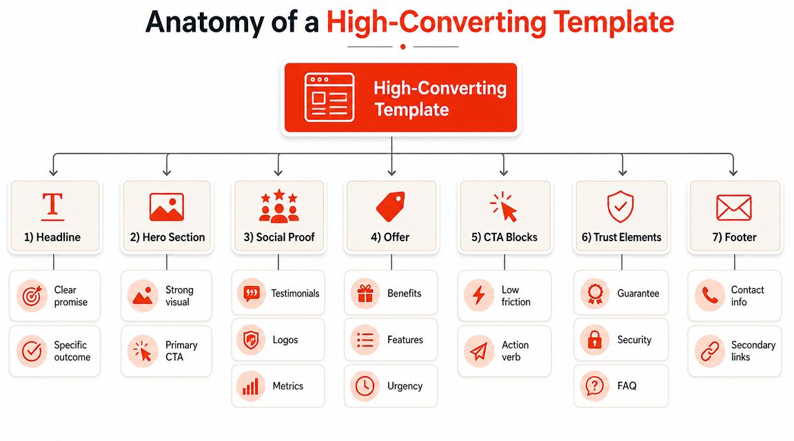
Anatomy of a High-Converting Template
A strong lead generation website template is built like a sales conversation. It answers four questions in order. What is this? Is it for me? Can I trust you? What should I do next?
Here’s the visual hierarchy most templates should follow.
Start with one conversion goal
This is the primary rule. If the page is trying to book a consultation, don’t also push newsletter signup, social follows, downloadable guides, and “learn more” links in the same primary area.
Templates with a single, clear conversion objective perform better, while templates with multiple CTAs can suffer a 30 to 50 percent lower conversion rate, according to Emergent’s guide to building a lead generation website.
That doesn’t mean the page can’t answer questions. It means every section should support one decision.
The seven building blocks
Hero section
The hero has to do three jobs fast. State the offer. Clarify who it’s for. Present the primary call to action.
A weak hero says, “Welcome to Smith & Co.” A strong hero says what problem you solve and what happens next.
Trust layer
This usually sits right below the hero. It can include testimonials, certifications, recognizable client logos, review snippets, or industry associations. Don’t over-design this section. Its job is reassurance, not spectacle.
Problem and solution block
Explain that you understand the buyer’s situation. Then you connect that situation to your service. Keep it plain. Buyers don’t need a dramatic brand manifesto. They need to know you solve the problem they came with.
Benefits section
List outcomes, not just features. “Same-day scheduling” is a feature. “Get a response while the issue is still urgent” is the benefit that matters to a stressed buyer.
Process section
For local services, agencies, consultants, and B2B firms, this section lowers anxiety. Buyers want to know what happens after they click. A simple step-by-step flow helps.
Objection handling
This can be an FAQ, a comparison block, or a short text section. Handle common friction directly. Pricing uncertainty, timing, fit, geography, and what happens after inquiry are common issues to cover.
Final CTA
Close the page with the same action introduced at the top. Don’t invent a new offer at the bottom.
Practical rule: If a section doesn’t strengthen the same conversion action, remove it or move it elsewhere on the site.
What to keep out
A lot of underperforming templates fail because of what they include, not what they miss.
- Excess navigation: Helpful on a general website, harmful on a dedicated campaign page.
- Generic stock claims: “We care about quality” says nothing.
- Equal-weight service grids: They create browsing behavior when you need action.
- Competing buttons: If every button color is loud, nothing stands out.
Good templates feel simple because someone made hard choices. That’s the work.
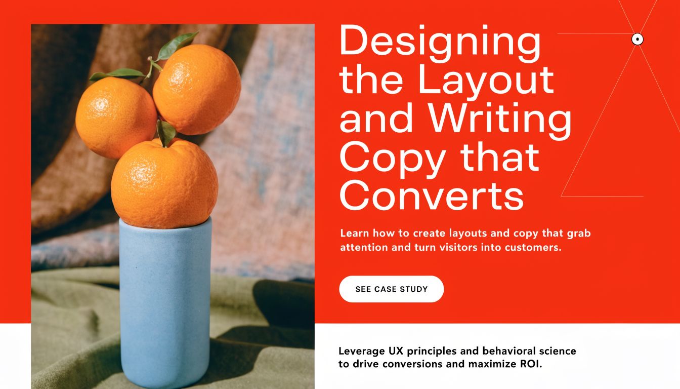
Designing the Layout and Writing Copy that Converts
Layout and copy usually fail together. Owners blame the design when the page feels weak, but often the problem is that the layout doesn’t support the message. Or the message asks the reader to work too hard.
The biggest design mistake I see on first lead gen builds is treating desktop as the “real” version and mobile as the resized version. That’s backwards for many businesses. Mobile accounts for 83 percent of landing page visits but converts at only 1.8 percent, compared with 3.9 percent on desktop, based on Apexure’s landing page lead generation guide. That gap explains why many sites feel busy but produce disappointing results.
Fix the mobile conversion leak
Responsive design is not enough. A page can technically fit on a phone and still be hard to use.
A mobile-first lead generation website template should do the following:
- Shorten the first decision: Keep the headline compact and specific.
- Use tap-friendly CTAs: Buttons need size, spacing, and contrast.
- Reduce input friction: If a form is necessary, ask for less at the start.
- Keep proof near the top: Don’t hide trust signals deep in the page.
- Control scroll fatigue: Long pages can work, but only if each section earns its place.
On desktop, a visitor may tolerate more comparison and exploration. On mobile, they’re often trying to solve a problem quickly while distracted. The template should match that context.
Write copy that sounds clear under pressure
Most website copy is too broad. It tries to sound polished instead of useful. Buyers don’t convert because your headline is clever. They convert because it helps them identify fit.
Here’s a practical framework that works well for service businesses:
| Copy element | Weak version | Better direction |
|---|---|---|
| Headline | Welcome to our company | State the problem solved or result delivered |
| Subheadline | We offer tailored solutions | Clarify who it’s for and what happens next |
| CTA | Learn more | Use an action tied to the offer |
| Benefits | Quality, integrity, service | Describe outcomes the buyer cares about |
Use visual hierarchy like a consultant, not an artist
The page should tell the eye where to go first, second, and third. That means headline first, action second, proof third. Too many templates reverse that order and bury the action under decorative sections.
A few practical layout choices make a real difference:
- Keep one dominant button style. If every action is equally styled, the page has no focal point.
- Use whitespace to separate decisions. Crammed sections feel harder to process.
- Align copy blocks consistently. Visual disorder makes the message feel less trustworthy.
- Pair claims with proof. If you promise speed, show how the process works.
On mobile, every extra field, extra click, and extra second of uncertainty pushes a buyer closer to leaving.
Don't write like your industry writes
Contractors copy other contractor websites. Agencies copy agency websites. Clinics copy clinic websites. That's how every page ends up with the same tired phrases.
Instead, write the way a good salesperson would talk after hearing the same buyer questions for years. Use direct language. Replace abstractions with specifics. Say what happens next. Explain who should inquire and who shouldn't. Good copy narrows the audience instead of trying to please everyone.
That's what gives a template its edge. Not design flair. Message discipline.
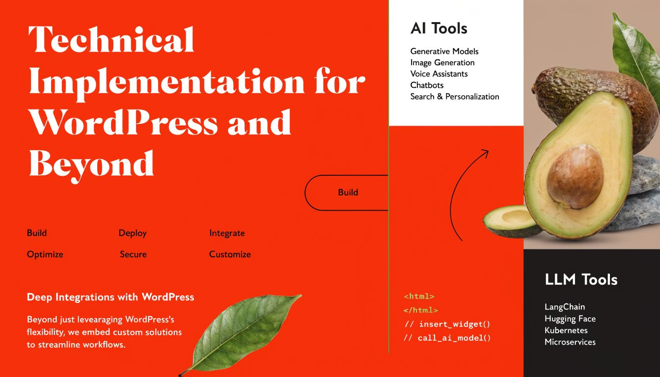
Technical Implementation for WordPress and Beyond
This is where many small businesses stall. They understand the strategy, but they're unsure how to build the thing without turning it into a technical side project.
The good news is that a lead generation website template doesn't require a custom development sprint. You need a stable stack, clean page control, and a setup you can maintain.
Option one, WordPress with a page builder
For most small businesses, this is the practical default. If your site already runs on WordPress, stay there unless something is badly broken.
A good WordPress setup usually includes:
- A lightweight theme: Use one that doesn't fight your builder.
- A page builder you can manage: Elementor, Beaver Builder, or a block-based workflow can all work.
- Reusable templates: Build a service page layout once, then clone and customize.
- Form and CRM compatibility: Your stack should connect cleanly to the tools you already use.
This route is best when you want marketing control without calling a developer every time you change a headline.
Option two, coded template or hosted builder
If you're not on WordPress, you still have two workable paths. Use a hosted builder with reusable sections, or deploy a simple HTML/CSS template and add scripts where needed.
A coded template makes sense when:
- your site is already custom-built
- your developer wants tighter control over speed
- you only need a small set of focused landing pages
- design consistency is already handled elsewhere
Hosted builders make more sense when speed of editing matters more than engineering purity.
Choose based on maintenance, not ideology
Owners often ask which platform converts better. That's usually the wrong question. The better question is which setup your team can keep clean, update quickly, and test without friction.
Use this decision lens:
| If this sounds like you | Better fit |
|---|---|
| “I need to edit pages myself” | WordPress with builder |
| “We already have a developer maintaining the site” | Coded template |
| “I need campaign pages fast” | Builder or reusable CMS sections |
| “Our current site is fragile and hard to update” | Simplify before you scale |
The technical benchmarks that matter
Performance affects conversion before a visitor reads a word. High-performing templates prioritize Core Web Vitals scores above 90 and load times under 3 seconds, and Unbounce's lead generation examples and benchmarks note that conversions can drop by over 53 percent for every second of delay beyond that.
That has practical implications for your build:
- Compress images before upload
- Avoid heavy animations in the hero
- Limit unnecessary plugins and scripts
- Use consistent heading structure
- Check mobile rendering on real devices
If you're building on WordPress, this roundup of WordPress lead generation plugins is useful for evaluating the pieces that support conversion without bloating the site.
Speed problems rarely come from one dramatic mistake. They usually come from ten small decisions no one questioned.
Technical implementation isn't about chasing perfect scores. It's about removing avoidable friction so your message gets a fair chance to work.
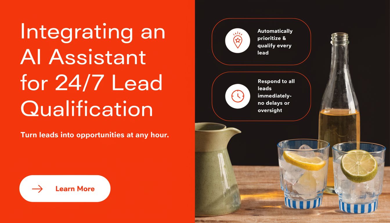
Integrating an AI Assistant for 24/7 Lead Qualification
Static forms are familiar, but familiar doesn't mean efficient. A contact form asks a visitor to stop, switch modes, and type into empty boxes with no feedback. That's a cold interaction, especially for first-time visitors who still have questions.
That model is aging badly. Businesses now need a lead capture system that can respond, clarify, and qualify in real time.
Why conversation beats a blank form
A form collects data. A conversational assistant collects context.
That difference matters. A visitor may not know whether they're a fit, which service to choose, or what to ask first. A conversational flow can handle that naturally. It can greet the visitor, answer basic questions, and gather the details you need to route the lead properly.
This is one reason automation has become part of modern lead handling. 91 percent of marketers view automation as essential for nurturing, and effective systems can save up to 75 percent of time on multi-channel campaigns, according to Coupler's lead generation dashboard examples. For a small team, that time savings matters less as a dashboard stat and more as a real operating advantage. Fewer manual follow-ups. Better first responses. More consistent intake.
What to configure in the assistant
If you replace or supplement forms with an AI assistant, don't think of it as a widget. Think of it as the front desk for your site.
Set it up around three decisions:
Qualification rules
Decide what makes a lead useful. For a local service business, that may be service type, location, urgency, and budget range. For an agency, it may be company size, project scope, and timeline.
Brand tone
The assistant should sound like your business. A family dental office, a law firm, and a SaaS consultancy should not all use the same voice.
Information capture
Collect what your team needs to act. Not just name and email. Ask for the details that shape the next conversation.
Buyers often abandon forms because forms ask for commitment before trust. Conversation builds trust while the information is being collected.
Integration is usually simpler than people expect
For most sites, adding an AI assistant is operationally easier than redesigning a multi-step form flow. Common paths are a WordPress plugin or a code snippet placed in the site template.
Once it's live, the better approach is to review actual conversations and tighten the prompts over time. You'll quickly see where visitors hesitate, what they ask first, and which qualification questions feel natural versus forced.
If you're mapping out the conversational flow itself, this guide on how to create a bot is a practical starting point. And if you're also thinking about how AI changes content operations more broadly, this AI SEO content generator guide gives useful context on where AI assists well and where human review still matters.
The important shift is conceptual. The best lead generation website template no longer ends with “Submit.” It starts a conversation.
Your Quick-Start Checklist and Optimization Plan
Most small business owners don't need more ideas. They need a clean build order. Use the checklist below to get a lead generation website template live without overcomplicating the first version.
Lead Generation Template Implementation Checklist
| Component | Status (To Do / Done) | Notes |
|---|---|---|
| Define one primary conversion action | To Do / Done | Booking, quote request, consultation, or qualification start |
| Create a reusable page template | To Do / Done | Use one structure for service, campaign, or location pages |
| Write a specific hero headline and subheadline | To Do / Done | Match search intent or traffic source |
| Add trust elements near the top | To Do / Done | Testimonials, reviews, certifications, or client logos |
| Build benefits and process sections | To Do / Done | Keep outcomes clear and steps easy to follow |
| Remove competing navigation and weak CTAs | To Do / Done | Reduce exits on high-intent pages |
| Review mobile layout on real devices | To Do / Done | Check buttons, spacing, and scroll experience |
| Improve page speed and technical hygiene | To Do / Done | Compress assets and trim unnecessary scripts |
| Replace or support forms with conversational capture | To Do / Done | Collect richer lead context |
| Connect lead capture to your follow-up workflow | To Do / Done | Route inquiries so the next action is fast |
| Set up measurement for page performance | To Do / Done | Track page-level conversion behavior |
| Schedule regular revisions | To Do / Done | Update copy, proof, and flow based on real use |
What to test first
Don't redesign everything at once. Start where small changes can reveal clear signals.
Test these in order:
-
Headline clarity
If the headline improves, more of the page gets read. -
Primary CTA wording
Sometimes the issue isn't the offer. It's that the button language is vague. -
Hero proof placement
Moving trust signals higher often helps skeptical buyers. -
Conversation flow or intake steps
If visitors engage but don't complete, reduce friction in the first interaction.
What not to obsess over early
Owners often burn time on logo size, subtle animations, or whether a page should feel more modern. Those details matter later. Early on, focus on fit, friction, and follow-up.
A page usually underperforms for one of these reasons:
- The traffic is mismatched
- The offer isn't clear
- The next step feels heavy
- The page loads poorly
- The team responds too slowly after capture
That's why optimization should stay grounded in behavior, not opinion. Review recordings if you have them. Read submitted inquiries. Compare high-intent pages to weak ones. Talk to sales or front-desk staff who handle incoming leads. They often know exactly where the site is failing because they hear the same confused questions every week.
The first version of a lead generation website template should be clean, fast, and measurable. It does not need to be clever.
A good template is never finished. It becomes more useful as you learn which message attracts the right buyer, which friction points stall them, and which lead capture method creates a real sales conversation instead of another low-quality form fill.
If you want to replace static forms with a conversational lead capture system, LeadBlaze is built for that job. It works as a 24/7 AI sales assistant that greets visitors, answers questions, qualifies leads, and delivers concise summaries instead of messy transcripts. You can install it with a WordPress plugin or code snippet, control the tone and qualification rules, and turn your website into a more responsive lead engine without adding complexity to your workflow.