If you want to get more conversions from your website, you have to stop throwing things at the wall to see what sticks. Real conversion rate optimization (CRO) is about systematically understanding how real people experience your site. It’s about finding the little moments of friction, clarifying your core message, and building the kind of trust that makes it a no-brainer for a visitor to take action.
Why Your Website Isn’t Converting

Before we get into specific tactics, let’s talk about why most websites struggle with conversions in the first place. It’s almost never about one broken button or picking the “wrong” shade of green for your CTA. Usually, it’s a fundamental disconnect between what you think your visitors want and what they actually experience.
Too many businesses get hung up on vanity metrics like traffic, celebrating more visitors without asking if they’re the right visitors. Others just copy their competitors, assuming that what works for someone else will automatically work for them. This is a huge mistake. That approach skips the most critical step: getting to know your own audience.
The Problem with Guesswork
Guessing is the enemy of growth. You might think your pricing is the problem when, in reality, your checkout process is just confusing. You could spend a fortune on a complete site redesign when all people really needed was a headline that clearly explained what you do.
Without data, you’re just taking shots in the dark. That’s why you have to establish a baseline. You absolutely need to know where you stand right now before you can measure whether the changes you make are actually helping.
The heart of conversion optimization isn’t about guesswork; it’s about making educated hypotheses based on how real people behave on your site and then testing those ideas. Real improvement comes from insight, not imitation.
Shifting to a Systematic Approach
To genuinely improve your website’s conversion rate, you have to move from random tweaks to a methodical process. This is a mindset shift—a commitment to continuous, iterative improvement.
The immediate goal is to deeply understand your user’s journey. What brought them here? Where are they getting stuck or confused? What questions are popping into their heads that your website fails to answer? Digging into these questions is where you’ll find your biggest opportunities. For a great overview of powerful strategies, check out these conversion optimization best practices.
This foundational work really boils down to three things:
- Analyzing User Behavior: Get familiar with tools like heatmaps and session recordings. They let you watch exactly how people navigate (or struggle with) your pages.
- Gathering Direct Feedback: Don’t be afraid to just ask. Simple on-page surveys or feedback forms can give you incredibly direct and valuable insights.
- Defining Key Metrics: Zero in on the numbers that actually signal a problem, like high bounce rates on important pages, cart abandonment, or half-filled forms. Knowing how to measure customer experience is essential for spotting these friction points.
Once you build this foundation, all the strategies we’re about to cover become infinitely more powerful. You’ll be making decisions based on evidence, not assumptions, which is the only way to get real, lasting results.
Building a High-Converting User Experience

Your website’s user experience (UX) is the invisible hand guiding visitors toward a sale—or pushing them away in frustration. It’s the sum of countless small interactions, but the very first one they’ll notice is speed.
Every second of delay, even a millisecond, wears down a user’s patience. In our world of instant gratification, a slow site feels broken or untrustworthy. It sends a clear signal that you don’t value your visitor’s time, dooming a potential conversion before your amazing offer even loads.
The Critical Role of Site Speed
The link between speed and revenue is crystal clear. Faster load times consistently lead to better conversion rates. For instance, a site loading in just one second can see conversion rates up to five times higher than one that takes ten seconds. With roughly 86% of pages now loading in under five seconds, speed isn’t a competitive edge anymore—it’s table stakes.
A slow website creates friction, and friction is the enemy of conversion. It’s a roadblock that sends potential customers packing before they even see what you have to offer.
A great place to start is with a free tool like Google’s PageSpeed Insights. It gives you a clear, no-nonsense look at how your site performs.
The report breaks down your speed on both mobile and desktop, pinpointing the exact culprits slowing you down, like bloated images or slow server response times.
Armed with that data, you can make targeted fixes. I’ve found a few common issues time and time again:
- Large, Unoptimized Images: Always compress your images before uploading. Modern formats like WebP can make a huge difference.
- Too Many Scripts and Plugins: Every third-party tool adds weight. Do a quick audit—if it isn’t essential, get rid of it.
- Poor Hosting: That cheap, shared hosting plan might be costing you more in lost sales than you’re saving.
Crafting Intuitive Navigation
Once your site is lightning-fast, the next challenge is helping visitors find what they need. Cluttered, confusing navigation is another major conversion killer. If people can’t figure out where to go, they won’t stick around to solve the puzzle.
Think of your navigation as a helpful guide. Put yourself in the shoes of a first-time visitor. Is it immediately obvious where to find your products, pricing, or contact info?
A seamless user journey is one where the visitor doesn’t have to think. Each click should feel natural and predictable, moving them closer to their goal without any confusion or second-guessing.
Designing for a Seamless Mobile Experience
Let’s be blunt: optimizing for mobile isn’t optional anymore. Most of your traffic is likely coming from a smartphone, yet so many sites still deliver a clunky, frustrating experience on smaller screens. This is a massive missed opportunity to increase your website conversion rate.
And a truly mobile-friendly experience is about more than just a “responsive” template.
- Simplify Forms: Nobody wants to fill out a long form on their phone. Strip it down to the absolute essentials.
- Make Buttons Tappable: Your CTAs and links need to be big enough for a thumb to tap easily, with plenty of space around them to avoid mis-clicks.
- Prioritize Readability: Use large, clear fonts and short, scannable paragraphs. Walls of text are a death sentence on mobile.
Before you can build a high-converting machine, you must first understand how to optimize your User Experience. To go even deeper, check out our complete guide on how you can optimize your user experience. By putting speed, clear navigation, and a flawless mobile interface at the forefront, you create an environment where converting feels like the most natural next step.
Writing Copy and CTAs That Actually Convert
So, you’ve got a fast, beautiful website. That’s a great start. It gets people in the door, but it’s your words that ultimately convince them to stay and buy. Think of your website copy as your best salesperson, working around the clock. If that salesperson is boring, confusing, or uninspired, you’re bleeding potential customers.
The secret to great copy isn’t about using big words or sounding clever. It’s about being incredibly clear, empathetic, and persuasive.
This all starts with your value proposition. It’s the most critical message on your entire site. Within seconds, a new visitor needs to know exactly what you do, who you do it for, and why you’re the best choice. If they have to dig around to figure it out, most of them will just give up and leave.
Move Beyond Features to Benefits
One of the biggest mistakes I see businesses make is obsessing over features. They’re proud of their tech, their materials, their processes. But here’s the thing: customers don’t buy features, they buy outcomes.
Your product might have a “lithium-ion battery,” but what your customer really hears is “a full day of power on a single charge.” One is a spec sheet detail; the other is a solution to the real-world problem of their phone dying at 3 PM.
You have to translate every feature into a tangible benefit for your customer.
- Instead of: Our software uses AI-driven algorithms.
- Try: Get smarter insights in half the time, without the guesswork.
- Instead of: This backpack is made from water-resistant nylon.
- Try: Keep your gear safe and dry, no matter what the weather throws at you.
This simple shift in perspective is a game-changer. It proves you understand your customer’s pain points, which builds an instant connection that a list of features never could.
Craft Headlines That Hook
Your headline is the first thing people read, and it has one job: to make them want to read the next sentence. You have just a few seconds to grab their attention. A vague or overly “creative” headline that doesn’t communicate immediate value is a recipe for a high bounce rate.
A great headline is specific, promises a clear benefit, and speaks directly to your ideal customer. It either solves a problem or sparks enough curiosity to pull the reader down the page. Don’t overthink it, but don’t underestimate its power.
The Power of Microcopy and Human Language
Conversions don’t just happen in the big, bold headlines. They happen in the tiny details—the button labels, the error messages, the placeholder text in a form field. This is your microcopy, and it has a surprisingly huge impact on user experience.
Instead of a cold, robotic “Invalid entry” message, why not try something like, “Oops! That email doesn’t look quite right. Can you check it?” This small dose of humanity can be the difference between a visitor who gets frustrated and leaves, and one who happily fixes the error.
Writing in a natural, conversational tone makes your brand feel more trustworthy and approachable. Always write as if you’re talking to one person, not a giant, faceless audience. It builds rapport and makes people more receptive to what you have to say.
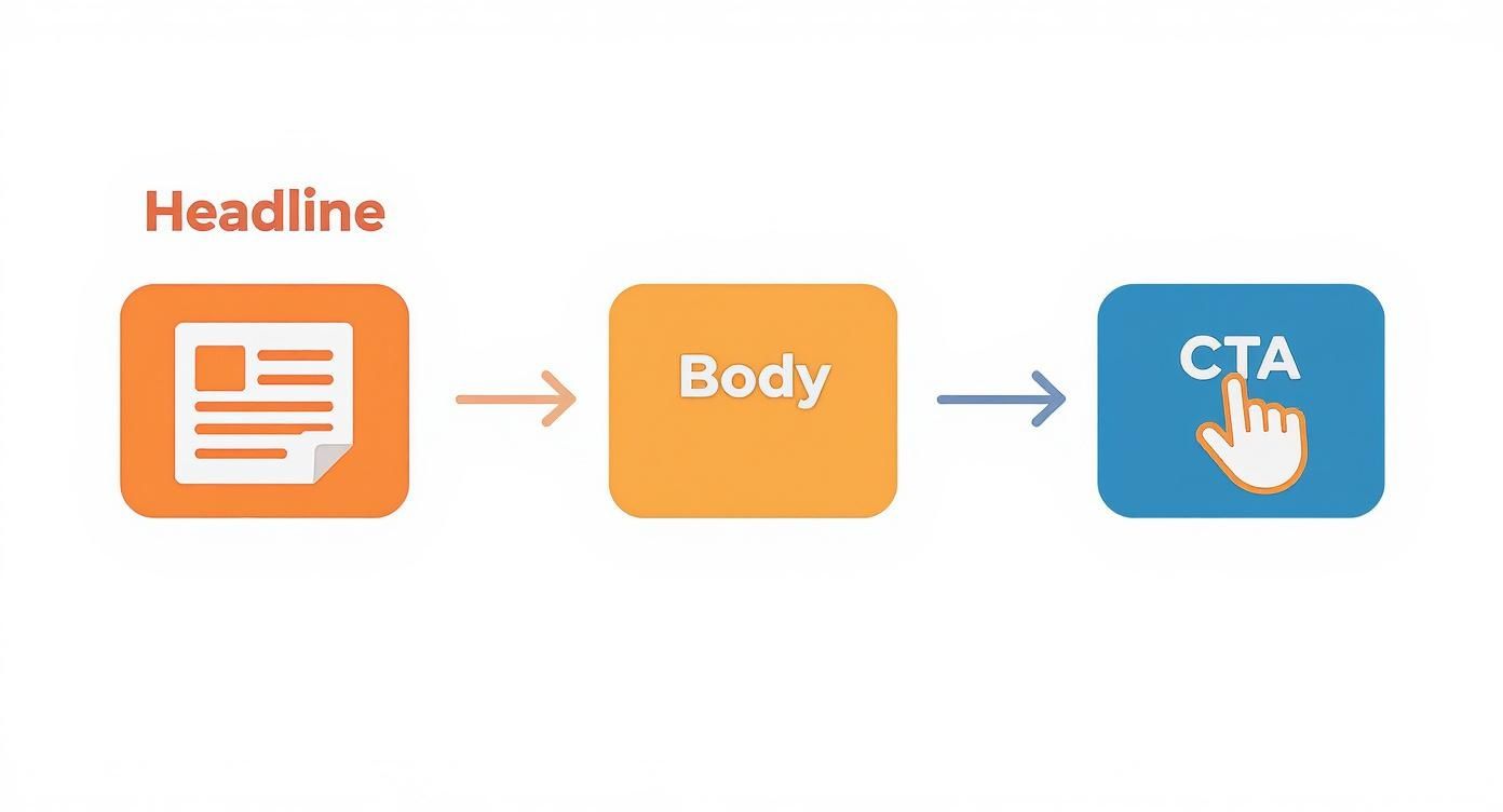
Design Calls to Action That Drive Clicks
Alright, this is it—the Call to Action (CTA). This is where the conversion actually happens, yet it’s where so many sites drop the ball with a lazy “Submit” button. Your CTA shouldn’t be an afterthought; it should be the compelling final chapter of the story you’ve just told on the page.
The text on your button needs to reinforce the value the user is about to get. “Submit” tells them nothing. “Get Your Free Quote” or “Start My 7-Day Trial” is active, specific, and focuses on the reward. This isn’t just theory; swapping generic words for benefit-driven ones has been proven to boost click-through rates time and time again.
For a CTA that actually works, make sure it has:
- Action-Oriented Language: Kick it off with a strong verb. Think “Download,” “Reserve,” “Claim,” or “Join.”
- Crystal-Clear Specificity: The user should know exactly what happens next when they click that button. No surprises.
- Visual Pop: Use a contrasting color that makes the button stand out. It should be impossible to miss.
- Smart Placement: Put your CTAs where motivation is at its peak, like right after a glowing testimonial or a powerful list of benefits.
Don’t forget that instant engagement tools can serve as powerful, dynamic CTAs, too. For instance, knowing how to make a chatbot can turn a passive visit into an active, helpful conversation, guiding users toward a purchase and capturing lead information effortlessly. When you master your copy and CTAs, you stop having passive visitors and start gaining active customers.
Running an A/B Testing Program That Actually Works
Making changes to your website based on a gut feeling is one of the fastest ways to waste time and money. If you’re serious about increasing your website’s conversion rate, you have to stop guessing and start testing. A systematic, data-driven A/B testing program is how you discover what your audience actually responds to, not just what you think they want.
The heart of a great testing program isn’t just launching a bunch of tests; it’s about launching the right ones. This all starts with a strong hypothesis—an educated guess about what specific change will lead to a specific, measurable result. A weak hypothesis like, “Changing the button color might help,” is a non-starter.
A solid hypothesis, on the other hand, is built on data. It sounds more like this: “Because user session recordings show visitors hesitating at the pricing table, we believe clarifying the feature differences will reduce drop-offs and increase ‘Start Trial’ clicks by 10%.” See the difference? It’s specific, measurable, and tied directly to observed user behavior.
Finding Your Best Testing Ideas
Great ideas for A/B tests don’t just appear out of nowhere. They’re usually hiding in plain sight within your existing data, just waiting for you to uncover them. Before you change a single pixel, you need to put on your detective hat and figure out where your users are getting stuck.
Your investigation should start with tools that reveal how people are actually using your site:
- Google Analytics: This is your home base. Dive into your conversion funnels and look for the biggest leak. If 80% of users are abandoning their cart on the shipping page, you’ve just found your ground zero.
- Heatmaps and Click Maps: Tools like Hotjar show you visually where people are clicking—and just as importantly, where they aren’t. A heatmap might reveal that tons of users are clicking on a non-linked image, signaling a major user experience flaw.
- Session Recordings: There’s nothing quite like watching real people interact with your site. You might see them rage-clicking a broken button or scrolling endlessly trying to find a piece of information. These recordings are absolute gold mines for testing ideas.
The real goal of A/B testing isn’t just to find a “winner.” It’s to gain insights into your customers’ psychology. Every test, whether it wins or loses, teaches you something valuable about what motivates (or frustrates) your audience.
This data-first approach helps you focus on fixing real user friction points, which dramatically increases the odds that your tests will produce a meaningful lift in conversions.
Prioritizing Your Tests for Maximum Impact
Once you have a list of data-backed ideas, you’ll run into a new problem: which one do you test first? You can’t test everything at once. This is where a simple prioritization framework can keep you focused on the highest-impact opportunities.
For each test idea, just score it based on three key factors:
- Potential Impact: How big of a difference could this change make? A headline test on your homepage has a much higher potential impact than changing the copyright date in your footer.
- Confidence: How sure are you that your hypothesis is right? An idea backed by both analytics data and session recordings is a much safer bet than a random guess from the marketing team.
- Ease of Implementation: How much time and developer effort will it take to get the test live? A simple text change is way easier than a complete page redesign.
To make this practical, you can use a simple table to score and rank your ideas.
A/B Testing Idea Prioritization Framework
This framework helps you move from a messy list of ideas to a clear, prioritized roadmap. Just assign a score from 1 (low) to 5 (high) for each category.
| Test Idea (Example) | Potential Impact (1-5) | Confidence (1-5) | Ease (1-5) | Priority Score (Impact+Confidence+Ease) |
|---|---|---|---|---|
| Change Homepage Headline | 5 | 4 | 5 | 14 |
| Redesign Entire Pricing Page | 5 | 5 | 1 | 11 |
| Add Trust Badges to Checkout | 4 | 3 | 4 | 11 |
| Change CTA Button Color | 2 | 2 | 5 | 9 |
After scoring, simply sort your list. The ideas with the highest scores are your top priorities. This simple exercise can bring a ton of clarity and focus to your CRO efforts.
Choosing Your Tools and Analyzing the Results
With your priorities straight, you need the right tool for the job. There are plenty of options out there, from free to enterprise-grade, each with its own benefits.
- Google Optimize: A popular and free choice that connects right into Google Analytics. It’s a fantastic starting point for anyone new to testing.
- Optimizely: A seriously powerful, feature-rich platform. It’s a great fit for mature testing programs that need advanced targeting and personalization capabilities.
- VWO (Visual Website Optimizer): Known for its friendly interface and a whole suite of CRO tools, including heatmaps and on-page surveys, all in one place.
Once a test is live, the hardest part is being patient. You have to let it run long enough to reach statistical significance—that’s usually around 95% confidence. This is crucial because it ensures your results are real and not just a random fluke. One of the most common mistakes I see is ending a test too early, which leads to acting on bad data.
When the test finally wraps up, dig deeper than just the conversion lift. Did the change affect other metrics, like time on page or bounce rate? Use every insight—win or lose—to fuel your next hypothesis. This creates a powerful cycle of continuous improvement that will steadily turn your website into a finely-tuned conversion engine.
Using Social Proof to Build Unshakeable Trust

Let’s be honest: trust is the invisible currency of the internet. Before anyone hands over their email or credit card number, they need to believe you’re legitimate and that your product actually works. This is where social proof comes into play—it’s the real-world evidence that other people have already taken that leap of faith and loved the outcome.
Think about it. Your clever copy and beautiful design can only do so much heavy lifting. Skepticism is the default setting for most people online. They’ve been burned before by shoddy products or nonexistent customer service, so their guard is always up.
Using social proof strategically is how you gently lower that guard. It’s a powerful psychological shortcut that says, “Hey, people just like you have been here before, and they’re happy. You’re in safe hands.”
The Many Flavors of Social Proof
Social proof isn’t a one-size-fits-all solution. It’s a whole toolbox of trust signals you can weave throughout your site. The real magic happens when you mix and match different types to address different user anxieties.
Here are some of the most effective forms I’ve seen work time and again:
- Customer Reviews & Ratings: This is your bread and butter. Star ratings give a quick gut-check, while detailed reviews offer the nitty-gritty reassurance some buyers need.
- Video Testimonials: Nothing builds trust quite like hearing a happy customer tell their story in their own words. Video feels authentic and is much harder to fake than text.
- Case Studies: For B2B or high-ticket services, in-depth case studies are non-negotiable. They showcase a clear “before and after,” proving tangible results and ROI.
- “As Seen On” Logos: Featuring logos from media outlets or well-known clients you’ve worked with is an instant credibility booster. You’re essentially borrowing their hard-earned reputation.
- Security Badges: Trust seals from companies like McAfee or Norton are crucial at checkout. They reassure visitors that their personal and financial data is safe.
Each one plays a different role, but together they build an airtight case for why a visitor should choose you.
Where to Place Trust Signals for Maximum Impact
Just having testimonials isn’t enough. You have to put them where they’ll do the most good. The goal is to anticipate a visitor’s hesitation and serve up the perfect piece of social proof right when they need it most.
Take a product page, for instance. Someone is actively weighing the pros and cons. This is the perfect spot for star ratings and a couple of your best reviews right below the product title. It instantly answers the question, “Do other people actually like this?”
The checkout page is another classic friction point where last-minute doubts can kill a sale. This is a critical place for security badges and maybe a short, reassuring quote about your money-back guarantee.
The best social proof never feels like a sales pitch. It feels like a helpful recommendation from a friend, placed exactly where you need it to answer an unspoken question.
Think through the entire user journey. On the homepage, a high-level banner like “Trusted by 10,000+ happy customers” or a few client logos works great. But on a specific features page, a testimonial about how that exact feature solved a major pain point is far more powerful. By matching the proof to the context of the page, you build confidence one step at a time.
Frequently Asked Questions About CRO
Even with the best plan in hand, you’re bound to have questions once you start getting your hands dirty with conversion rate optimization. It’s a field full of nuance, and sometimes you just need a quick, straight answer to get unstuck. Let’s dig into some of the most common questions I hear from people trying to boost their website’s conversion rate.
This should help clear up any confusion about the core ideas, what to expect, and how to apply everything you’ve learned.
What Is a Good Conversion Rate?
This is the million-dollar question, isn’t it? The most honest—and accurate—answer is: it depends. There’s no magic number that works for everyone. A “good” conversion rate is a moving target that shifts dramatically based on your situation.
Think about it: your industry, where your traffic is coming from, your product’s price point, and even what you’re counting as a “conversion” all play a massive role. A newsletter signup is a totally different beast than a high-ticket purchase.
For a bit of context, e-commerce stores selling personal care products might see a healthy 6.8% conversion rate, while a more considered purchase like fashion or jewelry could be closer to 1.9%. You can dig into more industry-specific data by checking out these e-commerce conversion insights, but don’t get too hung up on them.
The only benchmark that truly matters is your own. Your primary goal should always be to beat your last month’s or last quarter’s numbers, not to chase some abstract industry average.
How Long Should I Run an A/B Test?
I see this mistake all the time: people get excited and end their A/B tests way too early. It’s a costly error because you end up making decisions based on shaky, often random, results. You have to let a test mature.
Before you even think about calling a winner, you need to hit two critical milestones:
- Statistical Significance: You’re looking for a confidence level of at least 95%. This is your assurance that the results are real and not just a fluke. Don’t worry about the math; nearly all A/B testing tools handle this calculation for you.
- Sufficient Sample Size: You need enough data for the results to be reliable. The exact number will vary, but a solid rule of thumb is to wait until you have at least 100-200 conversions on each version you’re testing.
For most businesses, this means you need to run your test for at least two full weeks. This helps smooth out any weird fluctuations between weekday and weekend visitor behavior. Patience pays off here.
What Should I Test First?
When you’re just starting out, the urge to test everything is strong. Resist it. Throwing everything at the wall to see what sticks just creates noise. The key is to be strategic and prioritize your tests based on what will likely have the biggest impact.
Start with the heavy hitters—the elements that are most visible and have the most sway over a user’s decision.
- Your Headline and Value Proposition: This is your first impression. A clear, compelling headline can be the difference between a visitor staying to learn more or immediately hitting the back button.
- Your Call to Action (CTA): Play around with the text, color, size, and placement of your main CTA buttons. You’d be amazed at how a small tweak here can lead to a big lift.
- Page Layout and Design: Got a page with tons of traffic but a terrible conversion rate? That’s your prime candidate for a layout test. This is especially true for critical funnel pages like product pages or the checkout flow.
- The Offer Itself: Sometimes the page is fine, but the offer is weak. Test different pricing models, free trial lengths, or special bonuses to see what actually gets people to pull the trigger.
A simple pro-tip: always start with your highest-traffic pages. A 2% improvement on a page that gets 10,000 visitors is a much bigger win than a 20% improvement on a page that only a hundred people see.
Micro-Conversions vs. Macro-Conversions
To really understand what’s happening on your site, you have to look beyond the final sale. That’s where micro and macro-conversions come in.
Macro-conversions are the big wins. They’re the primary goals you’ve set for your website—the actions that directly impact your bottom line.
- Making a purchase
- Requesting a demo
- Submitting a contact form
Micro-conversions, on the other hand, are the smaller, “in-between” steps that signal a user is interested and moving in the right direction. They are incredibly valuable leading indicators.
- Signing up for your newsletter
- Downloading a PDF guide
- Watching a product video
- Adding an item to their cart
Tracking both is non-negotiable. A spike in micro-conversions, like more people adding items to their cart, can tell you that you’re on the right track long before those macro-conversion sales numbers start to climb. They help you pinpoint what’s working and what’s not all along the customer journey.
Ready to turn every website visitor into a qualified lead? LeadBlaze is a 24/7 AI sales assistant that engages every visitor with instant, helpful answers, qualifies them based on your rules, and delivers rich lead summaries directly to you. Stop letting potential customers slip away through static contact forms. Start your 7-day free trial with LeadBlaze today and see the difference.