Before you can even think about improving your website’s conversion rate, you have to know where you stand right now. This means getting a crystal-clear picture of your current performance to set a baseline. Without this starting point, any changes you make are just shots in the dark.
How to Establish Your Conversion Baseline
Jumping straight into A/B testing or a major redesign without a baseline is a classic mistake. It’s like trying to get directions without knowing your current location. The first step is to stop obsessing over vanity metrics like total traffic and start focusing on the actions that actually grow your business.
This whole process starts with a simple question: what is a “conversion” for your business? It could be a completed purchase, a submitted contact form, a newsletter signup, or a booked demo. Whatever it is, define it and make sure you’re tracking it.
Pinpoint Where Your Funnel Is Leaking
Your first real task is to play detective with your analytics. You’re hunting for the exact spots where you’re losing people.
Look for pages with high exit rates, especially in critical paths like your sales funnel or checkout process. These are the red flags that need immediate attention. Digging into user behavior flows in tools like Google Analytics can show you the exact journey people take before they give up and leave. This often uncovers confusing navigation or a broken step you never knew existed.
It’s also crucial to know where your best visitors are coming from. A study from Ruler Analytics found that direct traffic consistently brings in the highest conversion rates, averaging 3.3% across industries. This is a good deal better than paid search (3.2%), organic search (2.3%), and social media (1.8%). Knowing which channels send you high-intent users helps you double down on what’s already working. You can read more about these conversion rate statistics to see how you stack up.
This initial audit gives you a practical, data-backed roadmap. You’ll know which pages to fix first and which user groups deserve a better experience.
Key Takeaway: Your baseline isn’t just a number; it’s a story. It tells you who your best customers are, where they come from, and what obstacles are preventing others from joining them.
To get started, you’ll need to get comfortable with a few key metrics. Here’s a quick reference guide to what you should be tracking and where you can find the data.
Key Conversion Metrics and Where to Find Them
This table breaks down the essential metrics for understanding your baseline performance.
| Metric | What It Measures | Common Tools |
|---|---|---|
| Conversion Rate | The percentage of visitors who complete a desired action (e.g., purchase, form submission). | Google Analytics, Adobe Analytics |
| Bounce Rate | The percentage of visitors who leave your site after viewing only one page. | Google Analytics, Matomo |
| Exit Rate | The percentage of visitors who leave from a specific page, often within a funnel. | Google Analytics, Hotjar |
| Average Session Duration | How long, on average, visitors stay on your site during a single session. | Google Analytics, SEMrush |
| Funnel Drop-Off Rate | The percentage of users who exit a multi-step process (like checkout) at each stage. | Google Analytics, Mixpanel, Heap |
| New vs. Returning Visitors | The ratio of first-time visitors to those who have been to your site before. | Google Analytics, Adobe Analytics |
Once you’re tracking these numbers, the real insights come from slicing the data into meaningful groups.
Segment Your Data for Deeper Insights
Looking at your overall conversion rate is helpful, but averages can hide the truth. The real magic happens when you segment your audience. Comparing different user groups often reveals hidden problems and massive opportunities.
Here are a few essential segments to start with:
- New vs. Returning Visitors: Are people who come back converting more often? If not, you might have a problem with building trust or loyalty.
- Mobile vs. Desktop Users: If your mobile conversion rate is tanking compared to desktop, you’ve likely got a clunky mobile experience, slow page loads, or a checkout process that’s a nightmare on a small screen.
- Traffic Source: As the data shows, visitors from different channels behave differently. Segmenting by source lets you tailor your landing pages to what those users expect.
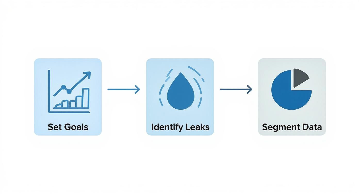
This process—setting goals, finding leaks, and segmenting data—is the foundation of any successful optimization strategy.
This structured approach turns a mountain of raw data into a clear plan of attack. By combining analytics with specialized software, you can finally stop guessing what works and start knowing. For a closer look at the platforms that can help, check out our guide on the best website visitor tracking tools.
Enhancing Site Speed and User Experience
Ever stared at your analytics and wondered why so many people bounce from your key pages? More often than not, the problem is a bad first impression. A slow, clunky website is one of the fastest ways to kill a potential customer’s interest. To really move the needle on your conversion rate, you have to get serious about speed and creating a smooth experience from the very first click.
Believe me, every single second counts. The data on load time is pretty eye-opening: websites that load in just one second see ecommerce conversion rates 2.5 times higher than sites that take five seconds. That gap is even more dramatic when compared to a site with a 10-second load time. It just goes to show how quickly visitor patience runs out.
Slashing Your Page Load Times
First thing’s first: you need to know where you stand. A great, free starting point is Google’s PageSpeed Insights. It gives you an instant report card on your site’s health.

This tool doesn’t just give you a score; it hands you a checklist of exactly what to fix, from oversized images to slow server response times. Once you have that report, you can start tackling the biggest offenders.
Here are the high-impact fixes I always recommend starting with:
- Compress Your Images: This is probably the most common speed killer I see. Huge, unoptimized images will drag your site’s performance down. Use a tool like TinyPNG or a similar plugin to shrink those file sizes without making your photos look grainy.
- Leverage Browser Caching: This is a simple but powerful technique. It tells a visitor’s browser to save parts of your website (like your logo and CSS files), so they don’t have to be re-downloaded on every subsequent visit. It makes a huge difference for returning users.
- Minimize Your Code: Bloated code is dead weight. Go through your HTML, CSS, and JavaScript and clean out anything that’s not essential. A tidier backend always leads to a zippier front-end experience.
For a deeper technical dive, focusing on improving application performance is a critical step to keep visitors from bouncing before they even see what you have to offer.
Designing an Intuitive User Journey
Speed gets them in the door, but a great user experience is what walks them toward the checkout. If your site is confusing or frustrating to use, people will simply leave. This isn’t about adding flashy animations; it’s about making things clear, simple, and intuitive.
Your primary goal should be to remove friction. Think about the path you want a user to take. Is your navigation logical? Can someone find what they need in just a couple of clicks? The less they have to think, the better.
Pro Tip: Designing with a “mobile-first” mindset isn’t optional anymore. More than half of all web traffic now comes from mobile devices, so your site absolutely must work flawlessly on a small screen. Don’t just rely on simulators—pull out your own phone and test everything. Try to fill out your forms, click the buttons, and navigate the menus to feel what your visitors are actually experiencing.
A smooth journey also means having calls-to-action (CTAs) that are impossible to miss and forms that don’t feel like a chore to complete. For a more detailed look at building a site your users will love, check out our guide on how to https://leadblaze.ai/blog/optimize-user-experience.
When you pair lightning-fast speed with a clear, intuitive path, converting stops feeling like a sales tactic and starts feeling like the natural next step for the user.
Writing Compelling Copy That Converts

Think of your website copy as your hardest-working salesperson. It’s on the job 24/7, tirelessly making your case to every single visitor. While slick design and fast load times get people in the door, it’s the words on the page that ultimately persuade them to stick around and take action.
To truly improve your website conversion rate, your copy has to do more than just describe what you do. It needs to forge an emotional connection, clearly articulate how you solve a real-world problem, and build a foundation of trust.
This all starts with your headline. You have just a few seconds to snag someone’s attention and convince them they’re in the right place. A great headline hits on a specific pain point or a deep-seated desire, making it nearly impossible for your ideal customer to look away.
After you’ve hooked them with the headline, your value proposition needs to immediately answer one simple question: “What’s in it for me?” Get straight to the point with benefit-driven language. Cut the vague marketing fluff and focus on the concrete results you deliver.
From Features to Benefits
This is one of the most common traps I see people fall into: they list product features but forget to explain the benefits. A potential customer doesn’t really care that your software has an “AI-powered scheduling algorithm.” What they do care about is that it will save them 10 hours a week on mind-numbing admin work.
Always, always translate a feature into a direct benefit. Show how it makes their life easier, better, or more profitable.
Key Insight: People don’t buy products; they buy better versions of themselves. Your copy should paint a vivid picture of that transformation, showing them exactly how your solution gets them from their current struggle to their desired future.
Applying this “benefit-first” mindset is a game-changer for product and service descriptions. Ditch the dry spec sheets and tell a story instead. Acknowledge your customer’s frustrations and position your offering as the hero they’ve been searching for. This simple shift changes the entire conversation from what you’re selling to what they’re gaining.
Building Trust with Social Proof
Let’s be honest—words from your happy customers are far more powerful than anything you can write about yourself. When you strategically sprinkle social proof throughout your copy, you build instant credibility and melt away any hesitation a buyer might have.
Here are a few proven ways to do it:
- Customer Testimonials: Place specific, results-oriented quotes right next to your calls-to-action. A quote like, “We increased our qualified leads by 40% in the first month,” crushes a generic “Great service!” every time.
- Case Studies: For bigger-ticket items or B2B services, detailed case studies are your best friend. They offer in-depth proof that you can solve complex problems for businesses just like theirs.
- Reviews and Ratings: Proudly display star ratings and reviews from trusted sites. This is especially crucial on product and checkout pages where a little extra confidence can make all the difference.
To make sure your message is hitting all the right notes, it’s always a good idea to study some best practice landing pages that are known for high conversion rates. When you combine a crystal-clear value proposition, benefit-packed descriptions, and undeniable social proof, you create a natural path that guides visitors straight to that final, all-important click.
Building a Smart A/B Testing Program
So, you’ve polished your copy and tweaked the user experience. What’s next? It’s time to stop making educated guesses and start letting your audience tell you what they want. This is where a methodical A/B testing program comes in—it’s the engine that turns one-off projects into a continuous cycle of improvement.
At its core, A/B testing (or split testing) is simple. You take a webpage and create a new version with a single change. Half of your traffic sees the original (the “control”), and the other half sees the new version (the “variation”). The one that gets more people to take the desired action wins.
Crafting a Strong Hypothesis
Every good test starts with a strong hypothesis, not a random idea you had in the shower. A real hypothesis is rooted in the data you’ve already pulled from your analytics and user behavior tools. It’s an educated guess with a clear structure.
Think of it like this: If I change [X], then [Y] will happen, because [Z].
For example, instead of a vague idea like, “Let’s test a green button,” a solid hypothesis would sound more like this: “If we change the CTA button on the product page from gray to a high-contrast orange, then we’ll see a lift in click-through rates, because the new color will create a stronger visual anchor against the page’s white background.”
See the difference? This framework forces you to articulate why you think the change will work, connecting your test to a real user behavior or psychological trigger.
Prioritizing Your Tests for Maximum Impact
You could probably list hundreds of things to test on your site, but you don’t have unlimited time or traffic. This is why smart prioritization is so important. A great place to start is with your pages that get high traffic but have low conversion rates. A small win on these pages can have a massive impact on your bottom line.
Not sure where to begin? Here are a few battle-tested ideas, ranging from simple tweaks to more involved changes:
- Headlines and Subheadings: Try pitting a benefit-driven headline against your current feature-focused one.
- Call-to-Action (CTA) Text: Does “Get My Free Guide” pull better than a straightforward “Download Now”?
- Button Color and Size: A brighter, larger button might feel obvious, but you’d be surprised how often it works.
- Images and Videos: Would a short demo video showing your product in action outperform your best static photos?
- Form Length and Fields: Every field you ask for adds friction. What happens if you remove just one non-essential field?
- Page Layout: Test your standard two-column design against a single-column layout that guides the eye directly to the CTA.
My Two Cents: Always start with tests that offer the biggest bang for your buck. Changing button text is a ten-minute job, while a full page redesign can take weeks. Rack up a few quick wins first to build momentum and get buy-in from your team.
Understanding Statistical Significance
This is where so many people go wrong. They run a test for a day, see one version pulling ahead, and declare a winner. Big mistake. Early results are often just statistical noise. You need to let the test run until it reaches statistical significance.
This is just a fancy way of saying you’re confident the results aren’t a fluke. The industry standard is a confidence level of 95% or higher. Pretty much any A/B testing tool, like VWO or Optimizely, will handle this calculation for you.
As a general rule, plan to run any test for at least two full business weeks. This helps smooth out any weird fluctuations from weekend traffic versus weekday traffic. Patience here is what ensures the changes you make will actually lead to reliable, long-term growth.
Using Email to Drive Repeat Conversions

So much of CRO focuses on that first-time visitor, but what about the people who already know you? Your email list is a goldmine. It’s a direct line to an audience that’s already raised their hand and said, “I’m interested.”
Don’t just think of email as a newsletter. It’s a powerful tool for bringing people back, nurturing leads who weren’t quite ready, and seriously improving your website conversion rate over time.
The numbers don’t lie. Email marketing campaigns boast an average conversion rate of 10.3%—a figure that leaves many other channels in the dust. The ROI is just as staggering, with businesses reporting returns between $36 to $40 for every dollar spent. You can find more eCommerce benchmarks on convertcart.com to see how it stacks up.
Create a Killer Welcome Series
Your first email sets the tone for the entire relationship. A solid welcome series does way more than just spit out a discount code; it builds instant rapport and walks new subscribers straight toward their first purchase.
Think bigger than a single, lonely welcome email. String together a sequence of three to five messages that land in their inbox over a few days.
- Tell your story: What makes your brand tick? Share your mission.
- Show them the good stuff: Highlight your best-sellers or most popular services to give them an easy place to start.
- Give them a little something: Offer an exclusive piece of content or a special deal as a thank-you for signing up.
This automated flow keeps you top-of-mind right when their interest is at its peak, making them much more likely to come back and buy.
Bring Back the Almost-Buyers
Abandoned carts. We all hate seeing them, but they’re actually a huge opportunity. Setting up an automated abandoned cart email is one of the single most effective things you can do. It’s a simple nudge that can bring back a surprising amount of otherwise lost revenue.
Your recovery email should feel helpful, not pushy. A picture of the item they left behind, a direct link back to their cart, and maybe a small incentive like free shipping is often all it takes to close the deal.
Key Takeaway: Stop looking at abandoned carts as lost sales. They’re high-intent leads who were just a click away from converting. A timely, personal email is often the only push they need.
Get Personal with Smart Segmentation
Sending the same generic blast to everyone on your list is a surefire way to get ignored. The real magic of email happens when you start segmenting—slicing your audience into smaller, more focused groups based on their actual behavior.
This lets you send offers that feel like they were made just for them.
Try creating segments based on:
- Purchase History: Did they buy a coffee maker? Send them an offer for your best-selling beans a month later.
- Website Activity: Target people who browsed a specific product category but never added anything to their cart.
- Demographics: Tailor your messaging based on location or other details you’ve collected.
This is how you turn subscribers into repeat customers and brand advocates. To get into the weeds of setting this up, take a look at our complete guide on marketing automation for small business.
Common Questions About Website Conversion
As you start digging into conversion optimization, you’ll find that the same few questions come up again and again. Let’s tackle them head-on, because getting these fundamentals right will make all your efforts more effective.
Think of this as the practical advice I wish I had when I was starting out. It’s about moving from just knowing the theory to actually getting results.
What Is a Good Website Conversion Rate?
This is the million-dollar question, and the only honest answer is: it depends. A “good” conversion rate is completely relative to your industry, traffic quality, the price of your product, and even what you’re defining as a “conversion.”
Sure, you’ll hear people throw around a general benchmark of 2-5%, but that’s a dangerously broad average. For example, a high-end B2B service might be thrilled with a 1% conversion rate on demo requests, while an e-commerce store selling low-cost items might see a 4% add-to-cart rate as a failure.
Your real competition is your past performance. The best benchmark is your own historical data. Aim to consistently beat last month’s numbers. That’s how you build real, sustainable growth.
How Long Should I Run an A/B Test?
Patience is a virtue in A/B testing. The goal isn’t just to find a winner, but to find a winner with statistical significance—usually a confidence level of 95%. This tells you the result isn’t just a fluke.
A few solid rules of thumb I always follow:
- Run tests for a minimum of two full business cycles. This usually means two weeks, which accounts for the natural ebb and flow of traffic between weekdays and weekends.
- Don’t peek! One of the biggest mistakes is calling a test early just because one version is ahead. Early leads often vanish. Let the test run its course until your tool says you have enough data.
- Volume matters. A page with thousands of visitors a day might reach significance in a week, while a lower-traffic page might need a month. Trust the math.
Which Page Should I Optimize First?
You want the biggest bang for your buck, right? Start where the opportunity is greatest: your high-traffic, low-conversion pages.
Think about it. A tiny improvement on a page that gets thousands of visitors will generate far more new leads or sales than a massive improvement on a page nobody sees.
Open up your analytics and look for pages with high visitor counts but disappointing performance. These are often key landing pages, product pages, or even a specific step in your checkout process with a high drop-off rate. Fixing these “leaky buckets” first will give you the fastest and most impactful wins.
Ready to stop missing out on valuable leads? LeadBlaze is a 24/7 AI sales assistant that engages every visitor instantly, answers their questions, and qualifies them based on your rules. Turn more of your hard-earned traffic into customers. Start your 7-day free trial at https://leadblaze.ai and see the difference.