
Optimizing the user experience is all about one thing: making your website or app feel effortless and genuinely helpful to the people using it.Optimizing the user experience is all about one thing: making your website or app feel effortless and genuinely helpful to the people using it. It’s the art of systematically removing friction and finding small ways to add delight, guiding a first-time visitor smoothly down the path to becoming a loyal customer.
Why a Better User Experience Is a Direct Line to Business Growth

Let’s cut through the buzzwords. A great user experience isn’t just a nice-to-have design flourish—it’s a core driver of revenue and customer loyalty. When you invest in making your platform easier and more enjoyable to use, you’re directly investing in your bottom line. Those seamless, intuitive interactions don’t just feel good; they translate directly into real-world business results.
The link between user satisfaction and financial success is incredibly powerful. The data shows that for every $1 spent on UX, companies can see an average return of up to $100. That’s an almost unbelievable 9,900% ROI, driven by higher conversions, happier customers who stick around, and fewer support tickets bogging down your team.
A well-thought-out UX strategy does more than just make your website look pretty. It builds trust, encourages repeat business, and can turn casual visitors into your biggest fans.
To truly grasp how to optimize the user journey, it’s helpful to break it down into its core components. These are the pillars you’ll want to focus on to see a tangible impact.
Core Pillars of User Experience Optimization
| Pillar | Primary Goal | Key Metrics |
|---|---|---|
| Usability | Make it easy for users to achieve their goals without friction. | Task success rate, time on task, error rate. |
| Accessibility | Ensure the experience is usable by people with disabilities. | WCAG compliance, keyboard navigation, screen reader compatibility. |
| Performance | Deliver a fast and responsive experience across all devices. | Page load speed, time to interactive (TTI), server response time. |
| Desirability | Create an engaging and aesthetically pleasing design that resonates with the brand. | User feedback, brand perception surveys, net promoter score (NPS). |
Focusing on these four areas provides a balanced approach, ensuring your platform is not only functional but also fast, inclusive, and enjoyable to use.
The Real-World Impact on Conversions
Think about an e-commerce site with a clunky checkout process. If a customer can’t find the “next” button, gets hit with unexpected shipping costs, or is forced to create an account, they’ll often just give up. That’s a lost sale. By streamlining that flow—maybe by adding a guest checkout option and providing clear visual cues—that same site can see an immediate lift in its conversion rate. It’s a direct result of removing a roadblock at the most critical moment.
Or consider a B2B company that’s struggling with lead generation. If their contact form is a massive wall of text asking for a dozen different things, potential leads will bounce. An optimized experience might involve:
- Cutting the form down to only the absolute essentials.
- Using progressive profiling to ask for more info over time, not all at once.
- Giving something valuable right away, like a free guide, in exchange for their details.
Building Loyalty and Slashing Churn
A frustrating interface doesn’t just lose you one sale; it can lose you a customer forever. When people struggle to navigate your app or find information on your site, they’re not going to stick around—they’ll just go to your competitor. Often, one bad experience is all it takes to ensure they never come back.
On the flip side, improving the user journey creates a positive feedback loop. When customers can get things done easily, their satisfaction soars. That satisfaction builds loyalty and dramatically improves retention. In fact, boosting customer retention by just 5% through a better UX can increase profits by at least 25%.
Automating parts of this journey can make a huge difference. For example, understanding how a chatbot for your website can offer instant 24/7 support is a fantastic way to reduce frustration and improve engagement from the very first click. It all comes back to a simple idea: focus on the user, and you’ll build a foundation for sustainable, long-term growth.
Getting Inside Your Users’ Heads

You can’t really optimize user experience for people you don’t actually know. The first real step is moving past surface-level demographics and getting into your users’ heads. What makes them tick? What are their real-world motivations, what frustrates them, and what are they ultimately trying to accomplish?
It all starts with empathy. Instead of guessing what users want, you have to build your strategy on what you know they need. This is where user research comes in, and trust me, it doesn’t have to be some complicated, expensive ordeal.
Building User Personas That Actually Work
A user persona is essentially a semi-fictional character you create based on your ideal customer. But this isn’t just about listing their age and location; it’s about crafting a story that makes them feel real. A great persona digs deep into the “why” behind their behavior.
So, where do you start? With real data. Your customer support inbox is an absolute goldmine. It’s packed with common questions and, more importantly, common pain points. If you see dozens of tickets complaining about the checkout process, that’s a massive clue for your “E-commerce Shopper” persona.
A solid persona should always include:
- Goals: What is this person trying to achieve on your site?
- Motivations: What’s driving them to find a solution like yours in the first place?
- Frustrations: What specific roadblocks are stopping them?
- A “Day in the Life” story: A short narrative that brings their challenges to life.
Think of a persona as your north star. Whenever you’re stuck on a design decision, you can just ask, “Would this really help Sarah, the busy project manager, get her work done faster?”
Mapping Out the Entire User Journey
Okay, so you know who your users are. Now what? The next step is figuring out how they actually interact with your product from their very first impression to becoming a loyal customer. A user journey map is just a visual way to chart this entire process, tracking every single touchpoint.
This map is your secret weapon for finding moments of friction—and opportunities for delight. It should follow their actions, thoughts, and even their emotional state through each phase: awareness, consideration, purchase, and beyond.
For instance, a journey map might show that users are excited when they first land on your homepage but get stressed out by a confusing pricing page. Boom. That insight tells you exactly where to focus your energy. Simplify the pricing, and you’ve just smoothed over a major bump in their experience.
How to Uncover Insights Without a Big Budget
You don’t need to commission a massive research study to get valuable feedback. Some of the best insights I’ve ever gotten came from simple, direct conversations.
Try running a few informal user interviews with a handful of customers. A quick 15-minute video call can reveal usability issues you’d never spot on your own. You can also use the channels you already have. Reaching out to people via email or social media can work wonders. In fact, you can even explore options like automated direct messages to start these conversations at scale.
When you bring together detailed personas, a clear journey map, and direct user feedback, you build a rock-solid foundation for every decision you make. This deep understanding ensures you aren’t just making random changes—you’re making the right changes that genuinely help your users.
Using Behavioral Analytics to See What Users Do

Alright, you’ve got your user personas and journey maps. That’s a solid foundation, but it’s still based on assumptions. Now it’s time to see what people actually do when they land on your site. This is where you stop guessing and start watching.
Behavioral analytics tools give you an unfiltered, over-the-shoulder look at real user behavior. While traditional analytics provide the “what” (bounce rates, page views), these tools deliver the “why.” They show you the exact moments of hesitation, confusion, or frustration that numbers alone can never reveal.
Decoding User Behavior with Heatmaps
Heatmaps are one of the most intuitive tools in the UX toolkit. They translate user interaction data into a simple, visual format—think of it like thermal vision for your website. They immediately show you what’s hot and what’s not.
There are a few key types I always recommend using together:
- Click Maps: These show you exactly where people click. Bright red spots highlight popular elements, but more importantly, they can reveal a “dead” button that you thought was a primary call-to-action.
- Scroll Maps: This is a big one. A scroll map shows how far down the page people actually go. If you find that 80% of users never even reach the brilliant testimonial section you placed at the bottom, that’s a clear signal to move critical content higher up.
- Move Maps: These track where users hover their mouse cursor, which is often a strong indicator of where their eyes are focused. It’s a great way to see which headlines or images are grabbing attention.
I once worked on a site where a click map showed a flurry of clicks on a static, non-interactive icon. Users were clicking out of frustration, thinking it was a button. This is what we call a “rage click,” and it’s pure gold—a sign of a design flaw that standard analytics would have completely missed.
Behavioral analytics closes the gap between what you think users are doing and what they’re actually doing. The insights are often surprising and always actionable.
Uncovering Friction with Session Replays
If heatmaps give you the big picture, session replays provide the granular, moment-to-moment details. These tools record anonymous user sessions, letting you watch a video of someone navigating your website just as they did. It’s like having a one-way mirror into their experience.
This is an absolute game-changer for diagnosing complex problems. Let’s say your analytics show a high drop-off rate on your checkout page. A few session replays might reveal the culprit: a confusing form field, a clunky date-picker, or an error message that makes no sense.
This isn’t just theory; it delivers real results. The team at Supademo, a SaaS company, used session replays to figure out why new users were getting stuck during onboarding. By watching these recordings, they pinpointed the exact moments of confusion and refined their user guidance. The result? A 39% reduction in the time it took for users to get value from their product. You can find more insights like this by exploring emerging user experience trends on clarity.microsoft.com.
Turning Observations into Improvements
Gathering all this data is fascinating, but it’s useless until you act on it. The goal is to turn these observations into tangible improvements.
Start by looking for patterns, not just one-off oddities. If one person struggles with a form, it might be an outlier. If ten people do, you’ve found a genuine problem.
Once you spot a recurring issue, form a clear hypothesis. For example: “Users are missing our primary CTA. We believe that by changing the button color from grey to green, we’ll increase click-throughs.”
Finally, test your hypothesis. Use A/B testing to roll out the change to a segment of your audience and measure the outcome against the original. This data-driven approach ensures you’re making changes that actually move the needle.
By combining the broad view of heatmaps with the detailed stories from session replays, you get a complete picture of your user experience. You can stop making educated guesses and start making decisions based on real human behavior.
Practical Design and Content Strategies That Work
Once you have a handle on how people are actually using your site, it’s time to roll up your sleeves and make some targeted changes. This isn’t about tearing everything down and starting from scratch. Instead, the goal is to optimize the user experience through smart, strategic adjustments to your design and content.
Think of it as removing small roadblocks. These little wins add up, turning a clunky journey into a smooth one. You’d be amazed at how a few tweaks to your navigation, forms, or on-page copy can produce dramatic results.
Just look at the impact a few focused UX improvements can have on the numbers.
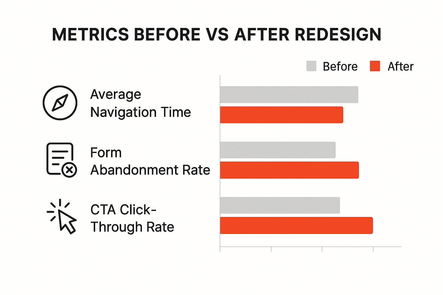
As you can see, a simpler user journey means people complete tasks faster, fewer users get frustrated and abandon forms, and—most importantly—more of them convert.
Simplify Your Site Navigation
Confusing navigation is a visitor’s worst enemy. If someone can’t quickly find what they’re looking for, they’re not going to stick around and play detective. They’ll just leave. Your navigation should be so intuitive that it’s practically invisible.
Here are a few actionable ways to clean things up:
- Limit Menu Items: Try to stick to a maximum of seven main navigation links. This keeps users from feeling overwhelmed by too many choices.
- Use Clear Labels: Ditch the clever jargon. Straightforward terms like “Services” or “Contact Us” work much better than vague phrases like “What We Do.”
- Ensure Mobile Friendliness: Pull out your phone and test it. Is the hamburger menu easy to tap? Are the links inside legible and properly spaced?
The data backs this up. A staggering 38% of users will bounce if they find the layout or content unattractive. A clean, mobile-first design isn’t a luxury anymore; it’s a necessity. For more on this, UserGuiding has some great insights into current UX trends.
Streamline Forms and User Inputs
Forms are a notorious friction point. Whether it’s a contact form, a newsletter signup, or a checkout process, every extra field you add is another reason for someone to give up.
The guiding principle here is ruthless simplicity. Ask only for what is absolutely essential at that moment. You can always gather more details later on.
Take a lead capture form, for example. Instead of demanding a name, company, job title, and phone number right away, why not start with just an email address? It’s a low-commitment first step that gets your foot in the door.
For more involved processes, an AI assistant can be a game-changer. Learning how to make a chatbot can help you guide users through questions conversationally. This makes the whole thing feel less like a chore and more like a helpful dialogue, often boosting completion rates and the quality of information you receive.
UX Improvement Quick Wins
Many common UX headaches have surprisingly simple solutions. Here’s a quick-reference table to help you spot problems and implement fixes that deliver real impact.
| Common Problem | Quick Fix Solution | Expected Impact |
|---|---|---|
| Confusing Navigation | Limit menu to 5-7 items with clear, simple labels (e.g., “Pricing” not “Our Value”). | Reduced bounce rate, faster task completion. |
| High Form Abandonment | Remove all non-essential fields. Use multi-step forms for longer processes. | Increased lead generation and sign-ups. |
| Low-Contrast Text | Use a contrast checker tool to ensure text is easily readable against its background. | Improved accessibility, better engagement. |
| Unclear Call-to-Action | Make CTAs action-oriented and visually distinct (e.g., “Get Your Free Trial” on a bright button). | Higher click-through and conversion rates. |
| Slow Page Load Times | Compress images before uploading them. Defer loading of non-critical scripts. | Lower bounce rates, improved SEO rankings. |
This table isn’t exhaustive, of course, but it covers the low-hanging fruit. Fixing even one or two of these issues can make a noticeable difference in how users perceive and interact with your site.
Building a Culture of Continuous Improvement
Landing on a great user experience isn’t a finish line; it’s a starting point. The best products don’t just get launched and left alone. They evolve. This means building a system where you are constantly listening, testing, and tweaking based on what real people are doing.
This creates a powerful feedback loop. Your interface stops being a static design and becomes a living thing, adapting to what your users actually want and need. When you get this right, UX isn’t just a task on a checklist—it becomes part of your company’s DNA.
A Practical Approach to A/B Testing
When opinions clash, data is the ultimate tiebreaker. That’s where A/B testing comes in. It’s a straightforward method for comparing two versions of a single element to see which one performs better. You could test anything from a headline to a button color or a call-to-action.
Let’s say you have a theory that changing your “Sign Up” button to “Get Started Free” will boost clicks. Instead of just making the switch and crossing your fingers, you run a test. Version A (the original) goes to 50% of your audience, while Version B (the new text) goes to the other 50%.
A week later, you check the results. Version B has a 20% higher click-through rate. Boom. The data gives you a clear winner. You’ve just removed all the guesswork from the decision and made a change backed by actual user behavior.
Gathering Direct Feedback with Usability Testing
A/B tests are fantastic for telling you what users do, but usability testing uncovers why they do it. This doesn’t have to be some formal, lab-coat affair. You can learn an incredible amount just by watching a handful of people try to complete a task on your site.
Here’s how you can get started quickly:
- Define a Goal: Give a participant a clear, simple task. For example, “Find the pricing page and start a free trial.”
- Observe and Listen: The key here is to stay quiet. Let them navigate on their own and encourage them to think out loud. You want to hear their raw, unfiltered thoughts as they go.
- Take Notes: Jot down every hesitation, every confused click, and every moment of frustration. These are the friction points you’ve probably become blind to over time.
You’ll learn more from watching one person use your website for five minutes than from a week of internal meetings. Direct observation cuts through assumptions and reveals the truth about your user experience.
This cycle of testing, listening, and improving is what separates good UX from great UX. Each experiment, whether it’s a quick A/B test or an informal usability session, peels back another layer of understanding. By making this iterative loop a core part of your process, you ensure your user experience never stops getting better.
Got Questions About UX? We’ve Got Answers
When you start digging into user experience, a few key questions always seem to pop up. Let’s tackle some of the most common ones so you can feel more confident applying these ideas to your own work.
UI vs. UX: What’s the Real Difference?
It’s easy to get User Interface (UI) and User Experience (UX) mixed up, but they play very different roles. I’ve always liked this analogy: UI is the saddle, the stirrups, and the reins. UX is the feeling you get from actually riding the horse.
UI (User Interface) is all about the tangible, visual stuff a user interacts with. Think buttons, icons, color palettes, and the overall layout. It’s the look and feel.
UX (User Experience) is the bigger picture. It’s the entire journey a person has with your product—how easy it is to use, how fast it loads, and whether they walk away feeling frustrated or delighted.
A beautiful UI is a fantastic start, but it’s just one piece of the puzzle. Great UX is about making the entire interaction work seamlessly for the user.
How Can I Actually Measure the ROI of My UX Work?
This is a big one. Tying your user experience efforts back to the bottom line is all about tracking the right metrics before and after you make a change. The whole point is to connect your design improvements to real business results.
You can calculate a clear return on your UX investment by putting a dollar value on metric improvements. Think about what a higher average order value or a lower customer churn rate is actually worth to your business.
Here are a few key performance indicators (KPIs) to keep a close eye on:
- Conversion Rates: Are more visitors signing up for your newsletter, making a purchase, or completing another key action?
- Customer Lifetime Value (CLV): Are your customers sticking around longer and spending more over time?
- User Retention: Do people keep coming back to use your product or service?
- Support Ticket Volume: Have your UX fixes led to fewer people needing to contact support for help?
How Can a Small Business Improve UX on a Shoestring Budget?
You absolutely don’t need a huge budget to make a real impact. It’s all about being scrappy and focusing on what matters most. Start by tapping into free tools like Google Analytics and Microsoft Clarity to see where users are getting stuck—it won’t cost you a dime.
From there, get direct feedback. You don’t need a formal lab. Just grab a few loyal customers, or even friends and family, and watch them use your site. Look for the “quick wins”—those high-impact, low-effort changes like simplifying your main navigation, boosting your site speed, or rewriting a confusing call-to-action.
Ready to stop losing leads to confusing forms and delayed responses? LeadBlaze offers a 24/7 AI sales assistant that greets every visitor, answers their questions instantly, and qualifies them based on your rules. Start your 7-day free trial and see how effortless lead generation can be.