If you want to reduce your website’s bounce rate, you have to nail one thing above all else: meet visitor expectations instantly. The moment someone lands on your page, they need to know they’re in the right place. If they can’t figure that out in a split second, they’re gone. It really all comes down to page speed, relevant content, and dead-simple navigation.
Why Visitors Leave Without a Second Click
Before you start changing things, you need to understand what a high bounce rate is actually telling you. It’s not just a metric on a dashboard; it’s a red flag signaling a gap between what your visitor wanted and what you delivered. A bounce is simply when someone lands on your site and leaves without doing anything else—no clicks, no form fills, nothing.
Think of it like someone walking into your store, taking a quick look around, and immediately turning around to leave. Something was off.
Pinpointing the Root Causes
A few usual suspects are almost always behind a high bounce rate. These are the little friction points in the user experience that gently (or not so gently) shove people toward the back button.
I’ve seen these pop up time and time again:
- Slow Page Load Speed: A site that takes longer than three seconds to load can kiss nearly half its visitors goodbye. Online, patience is a myth.
- Mismatched Content Intent: The classic bait-and-switch. Your page content doesn’t deliver on the promise made in your search snippet, ad copy, or social media post.
- Poor Mobile Experience: If your site is a clunky, pinch-and-zoom nightmare on a phone, you’re alienating a huge chunk of your audience.
- Confusing Website Navigation: People won’t stick around to solve a puzzle. If they can’t figure out where to go next, they won’t even try.
This visual breaks down the process of figuring out exactly why people are bouncing.
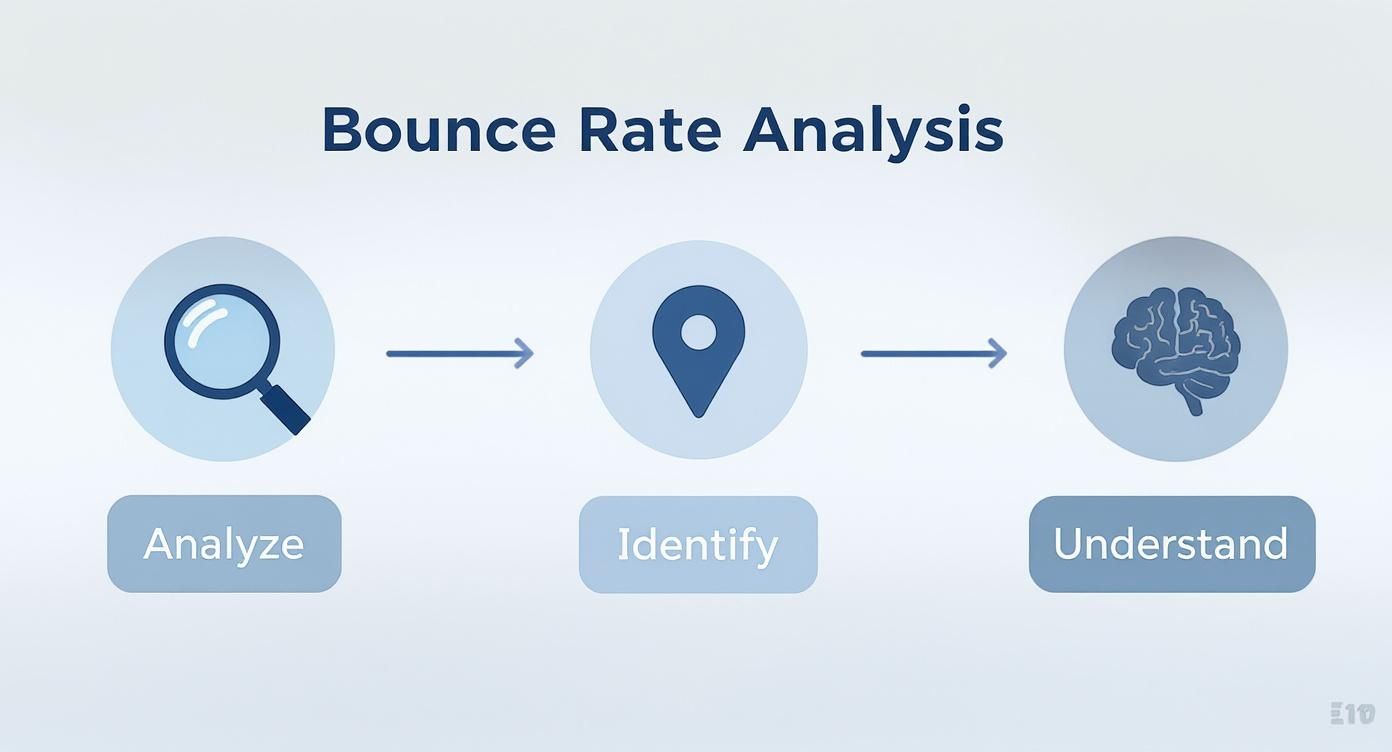
The big takeaway here is that you can’t just guess your way to a lower bounce rate. It’s a methodical process of digging into your data, finding the problem spots, and understanding the human behavior driving those numbers.
Uncovering the “Why” with Data
To get past the assumptions, you have to play detective. Your journey starts with a tool like Google Analytics, but that only tells you what happened. To find out why it happened, you need to get a bit more creative.
This is where session recording and heatmap tools are worth their weight in gold. They let you see what your users see, showing you exactly where they move their mouse, what they click on, and precisely how far down the page they scroll before they bounce. It’s the best way to spot broken links, confusing layouts, or content that just isn’t engaging.
A truly effective approach means optimizing the customer journey from start to finish. You have to look at every single touchpoint, from the ad they clicked to the final conversion you’re hoping for.
Key Takeaway: A high bounce rate is a symptom, not the disease. The real problem is a breakdown in the user experience—whether it’s speed, relevance, or usability. Focus on fixing the underlying frustrations first.
A great way to start is by segmenting your traffic. You might find your bounce rate is sky-high for visitors from a specific social media campaign or for users on a certain Android device. This kind of granular insight lets you make targeted, effective changes instead of just throwing spaghetti at the wall and hoping something sticks.
To give you a clearer picture, I’ve broken down the core areas of focus into a simple table.
Key Pillars for Reducing Website Bounce Rate
This table serves as a quick-reference guide, summarizing the essential areas you need to concentrate on to keep visitors on your site longer.
| Pillar | Primary Goal | Example Actions |
|---|---|---|
| User Experience (UX) | Make the site intuitive and effortless to use. | Improve mobile responsiveness, simplify navigation menus, use clear calls-to-action (CTAs). |
| Content Relevance | Deliver exactly what the user expected to find. | Align page titles with content, use clear headings, answer the user’s core question immediately. |
| Technical Performance | Ensure the site is fast and error-free. | Optimize image sizes, enable browser caching, fix broken links (404 errors). |
| Visitor Engagement | Encourage interaction and further exploration. | Embed videos, add internal links to related content, include interactive elements like quizzes or calculators. |
By systematically addressing each of these pillars, you create a more “sticky” and valuable experience that naturally encourages visitors to stay and explore.
Optimize Your Website Performance for Speed
In the mad dash for user attention, speed isn’t just a nice-to-have; it’s the bedrock of a good user experience. A slow, clunky website is one of the quickest ways to send visitors scrambling for the back button. Every fraction of a second your site takes to load is a test of your visitor’s patience—and it’s a test you’re probably failing.
The link between site speed and user behavior is direct and brutal. Just think about your own habits online. When a page hangs, stalls, or loads elements one by one, your frustration spikes. You don’t wait; you leave. This isn’t just a hunch; it’s a well-documented reality that’s actively sabotaging your ability to keep people on your site.
The High Cost of a Slow Website
Slow load times are the silent assassins of engagement. Today’s web user expects instant gratification, and even a tiny delay can have a massive impact on their decision to stick around. This is especially true for mobile users, who are often on the move and have zero tolerance for lag.
The data tells a pretty stark story. Research shows that as page load time goes from one to ten seconds, the probability of a mobile visitor bouncing skyrockets by a staggering 123%. In fact, a site that takes longer than just three seconds to load risks losing over half of its mobile visitors before they even see your content. You can dig into the full findings on website speed and user behavior here.
This is exactly why optimizing your website’s performance isn’t some task you can push off to your developer for “later.” It’s a fundamental step in learning how to reduce your bounce rate, and you need to tackle it today.
Diagnosing Your Speed Bottlenecks
Before you can start fixing things, you have to know what’s actually slowing you down. Guesswork isn’t going to get you anywhere. Thankfully, tools like Google PageSpeed Insights give you a free and incredibly detailed diagnostic report of your site’s performance on both mobile and desktop.
These tools don’t just give you a score; they highlight the specific areas that are dragging you down.
Here’s what a PageSpeed Insights report looks like. It literally hands you a to-do list of opportunities for improvement.

This report gives you a clear, actionable list of technical issues, like unoptimized images or render-blocking resources, that are directly contributing to your slow load times. Tackling these specific items is your roadmap to a faster site.
Actionable Steps to Boost Page Load Times
Once you’ve got your diagnostic report in hand, it’s time to start implementing fixes. While some of these tasks might require a developer, many are straightforward enough for you to handle yourself. Here are the changes that will give you the most bang for your buck.
1. Compress and Optimize Your Images
Large, uncompressed images are the usual suspects behind slow pages. That beautiful hero image is worthless if it costs you your user’s attention.
- Use the Right Format: Switch to modern image formats like WebP. It offers far better compression and quality than old-school JPEGs and PNGs.
- Compress Before Uploading: Use a tool like TinyPNG or Squoosh to dramatically shrink file sizes without any noticeable loss in quality. It’s a quick, easy win.
- Implement Lazy Loading: This is a clever trick that defers the loading of images that are “below the fold” until the user actually scrolls down to them. This makes the initial page load much, much faster.
2. Leverage Browser Caching
Browser caching is like telling a visitor’s browser to “remember” parts of your website—your logo, CSS files, and other assets. When they come back or visit another page, their browser doesn’t have to re-download everything from scratch. This makes the experience feel lightning-fast for repeat visitors.
Pro Tip: Most modern hosting providers and content management systems like WordPress have simple plugins or settings to enable browser caching. A quick search for “enable browser caching” along with your platform’s name will almost always pull up a step-by-step guide.
3. Minify CSS, JavaScript, and HTML
Your website’s code is often full of extra characters—spaces, comments, and line breaks. These are helpful for developers reading the code, but for a browser, they’re just dead weight that slows things down.
Minification is the process of automatically stripping out all this unnecessary fluff to shrink the file size. This makes the code lighter and faster for a browser to download and process. Countless online tools and plugins can do this for you in just a few clicks.
4. Prioritize the Mobile Experience
A mobile-first approach isn’t optional anymore; it’s the only approach. Your website absolutely must be designed to load quickly and function flawlessly on a smaller screen. A responsive design that just squishes your desktop site down isn’t good enough. You have to think about the entire mobile journey.
This means making sure buttons are easy to tap, navigation is dead simple, and content is scannable for someone on the go. Taking the time to fully optimize user experience on all devices is critical. By creating a seamless, fast, and intuitive mobile environment, you’re catering to the majority of today’s web traffic and will see your bounce rate drop significantly.
Align Your Content with User Intent
Let’s be blunt: even the fastest, most beautiful website on the planet will fail if the content doesn’t deliver what it promised. When someone clicks your link from a Google search, they have a very specific need. Your page has just a few seconds to prove it has the answer. If it doesn’t, they’re gone.
That jarring disconnect between what a user expects and what they actually get is a massive driver of high bounce rates. You can have the best-written article in the world, but it’s completely useless if it doesn’t match what the visitor was actually looking for. Getting a handle on user intent is the first real step to bringing that bounce rate down.

Craft Headlines and Intros That Build Instant Trust
Your page’s headline (the H1 tag) and the first couple of sentences are the most valuable real estate you have. They absolutely must confirm to the visitor, “Yes, you’re in the right place.”
Think of your headline as a direct echo of their search query. If someone typed in “best lightweight hiking boots,” a headline like “The Top Lightweight Hiking Boots for 2024” is a perfect match. It’s a clear signal. On the other hand, a vague, artsy headline like “Our Newest Footwear Collection” creates immediate doubt and is an open invitation to hit the back button.
Your intro should then immediately build on that promise, telling the reader exactly what they’re about to get.
- Be direct: Get straight to the point. Tell them what the article is about.
- Acknowledge their problem: Show you understand what they’re struggling with.
- Promise the solution: Briefly outline the answers they’re about to find.
This one-two punch of a clear headline and a reassuring intro builds trust in a split second and gives them a reason to actually keep scrolling.
Key Insight: Your opening isn’t the time to be clever; it’s the time to be crystal clear. Reassure visitors they’ve found the solution, and they’ll give you their attention.
Make Your Content Scannable and Easy to Digest
Here’s a hard truth: people don’t read websites, they scan them. A giant wall of text is one of the most intimidating things you can throw at a visitor. It’s a surefire way to make them bounce.
Your job is to break your content into bite-sized, digestible pieces that guide the reader’s eye down the page. This isn’t about dumbing down your information; it’s about respecting your reader’s time and making your expertise accessible.
Simple Formatting Tricks for Better Readability
| Technique | Why It Works |
|---|---|
| Short Paragraphs | Stick to 1-3 sentences per paragraph. This creates white space and prevents that “wall of text” feeling. |
| Subheadings | These act like signposts, breaking up content into logical sections and letting people jump to what they need. |
| Bullet Points | Perfect for listing out features, steps, or key takeaways in a clean, easy-to-scan format. |
| Bold Text | Use it strategically to make key terms, stats, or important phrases pop off the page. |
By using these simple formatting tools, you turn a dense article into a user-friendly resource. This encourages people to actually engage with your material instead of feeling overwhelmed and clicking away.
Use Visuals to Break Up Text and Keep People Hooked
Let’s face it, text-only content can be pretty dry. Well-placed visuals act like “visual speed bumps” that break up long stretches of text, add valuable context, and make your content stick in the reader’s mind.
Visuals aren’t just there to look pretty; they’re a powerful communication tool. I’ve often found that a single good image or a short video can explain a complex idea far better than a few paragraphs of text ever could.
Here are a few ways to weave visuals into your content:
- Relevant Images: Use high-quality photos or custom graphics that actually support your points. For any kind of tutorial, screenshots are an absolute must.
- Informative Infographics: Got a lot of data or a complex process to explain? Turn it into a compelling infographic that’s easy to understand and share.
- Engaging Videos: Embed a quick video to demo a product, explain a concept, or walk someone through a tutorial.
Every visual you add is another opportunity to engage your visitor and keep them on the page longer. This variety makes the content feel more dynamic and less like a textbook, which is essential for bringing that bounce rate down.
Build Pathways with Internal Linking
A visitor landing on one of your pages is only half the battle. If that page is a dead end, they have one choice: hit the back button. This is where a smart internal linking strategy becomes your secret weapon against high bounce rates.
Think of your website as a well-planned city. Your pages are the destinations—the museums, parks, and cafes. Your internal links are the roads, subways, and walking paths that connect them all. Without clear pathways, visitors get lost, frustrated, and leave. Your job is to build a logical network that guides them from one interesting spot to the next, making their journey effortless.
Weave Links Directly into Your Content
The best internal links feel like a natural extension of the conversation. These are contextual links—they’re woven right into the body of your text, offering readers a chance to dive deeper into a related idea the moment their curiosity is piqued.
Relevance is everything here. You aren’t just dropping links for the sake of it. You’re anticipating what your reader might want to know next.
For instance, if you’re writing a blog post about healthy eating and you mention the concept of “meal prepping,” that’s the perfect moment to link to your in-depth guide on how to meal prep for the week. You’ve just created a helpful, non-intrusive pathway that adds immediate value and encourages another click.
Wikipedia is the undisputed master of this. Just look at how dense and effective their contextual linking is on the “Search Engine Optimization” article.
Nearly every key concept is a gateway to another page, creating an interconnected web of information that’s famously hard to leave. This approach not only keeps people on the site but also helps search engines understand the relationships between your content, which is great for SEO.
To pull this off, your anchor text—the clickable words themselves—needs to be descriptive. Ditch generic phrases like “click here.” Instead, use text that clearly explains the destination, like “learn more about our keyword research process.” This sets clear expectations and makes the click far more likely.
Offer a Clear Next Step
Not every link should be buried in a paragraph. Sometimes, you need to be direct. A compelling call-to-action (CTA) button or a bold text link is often the most effective way to guide a user, especially at the end of a piece of content.
Your CTAs should feel like the logical conclusion to whatever the user just read or watched.
- Finished a “how-to” guide? Offer a “Download the Free Checklist” or “Watch the Video Tutorial.”
- Reading a product feature page? The next step is probably to “See Pricing Plans” or “Book a Live Demo.”
- Just read a glowing case study? Prompt them to “Read Another Customer Story” or “Explore Our Services.”
The goal is to make the next action obvious and irresistible. You’re removing the guesswork and giving them a clear, valuable task instead of letting them default to the back button.
Pro Tip: Don’t create decision fatigue. A page with five different buttons is overwhelming and usually results in no action at all. Stick to one primary CTA and, if necessary, a secondary, less prominent option.
Add a “Related Posts” Section
This is one of the easiest and most effective tactics out there. Simply adding a “Related Posts” or “You Might Also Like” section at the bottom of your articles is a low-effort, high-reward way to keep people clicking.
Most modern CMS platforms like WordPress have plugins or built-in features that can automate this for you. These sections are so effective because they catch visitors at the perfect moment—right after they’ve finished your content and are wondering, “What’s next?”
By presenting a few highly relevant articles, you’re essentially saying, “If you liked that, you’ll love these.” This simple feature can quickly turn a potential bounce into a multi-page session, which is exactly what you need to drive that bounce rate down.
Create a Relevant Experience with Personalization
A one-size-fits-all website is a surefire way to get a high bounce rate. When people land on a page and see content that feels generic or totally irrelevant to them, they have zero incentive to stick around. Personalization completely flips this script, making each visitor feel like you know exactly what they’re looking for.
This goes way beyond just slotting a first name into a welcome message. I’m talking about dynamically changing the content, offers, and recommendations on your site based on who’s visiting. When you tailor the experience, you’re sending a clear signal that you understand their needs. That builds instant trust and stops them from hitting the back button.

Go Beyond a Generic Welcome
The easiest way to start is by using the data you already have to craft a more relevant user journey. You can start small and get more sophisticated as you learn more about your audience.
Here are a few practical ways to get the ball rolling:
- Geolocation Targeting: Show different content based on where someone is. A clothing site could feature heavy winter coats for a visitor from Chicago in December, while showing swimsuits to someone browsing from Miami.
- Behavioral Content: Tweak what users see based on what they’ve done before. If someone spent time reading your articles on marketing automation, your homepage could greet them with a banner for your newest guide on that very topic.
- Time-Based Offers: Display promotions that make sense for the time of day. A local restaurant’s website could push a “lunchtime special” banner between 11 AM and 2 PM.
This level of customization makes your site feel less like a static brochure and more like a helpful guide who knows what they need.
Dynamic Content in Action
Dynamic content is the engine that powers real personalization. It lets certain parts of your site—like headlines, call-to-action buttons (CTAs), or even images—change automatically for different groups of people.
Think about an e-commerce site that sells pet supplies. A brand-new visitor might see a general homepage with a mix of popular products. But a returning customer who has only ever bought dog food could be greeted with a banner that says, “Welcome back! Time to stock up on Fido’s favorite food?”
Key Insight: Personalization works because it lowers the mental effort required from your visitors. Instead of making them hunt for what’s relevant, you bring it right to them. This makes their decision to stay and look around a whole lot easier.
This proactive approach is one of the most effective ways to lower your bounce rate because it immediately connects your content with what the visitor probably wants.
The results can be pretty dramatic. Fast-fashion giant Shein, for example, managed a bounce rate of just 40.3%—way below the industry average—by using AI to personalize the products shown to each user based on their unique tastes and browsing history. When your content is that on-point, people are much more likely to click around.
Automate Engagement with Personalized Chat
Another fantastic tool for personalization is an AI chatbot. Instead of just having a static contact form, a chatbot can pop up with a personalized message based on the specific page a visitor is on.
For instance, if someone lands on your pricing page, a chatbot could ask, “Have questions about our plans? I can help you find the perfect fit.” That’s so much more engaging than a generic “How can I help you?” and shows you’re paying attention to their journey. Our guide on https://leadblaze.ai/blog/how-to-make-a-chatbot can walk you through how to set one up.
To take it a step further, you can even explore personalized accessibility, which adapts the web experience to each user’s specific needs. This not only enhances engagement but also proves that your brand genuinely cares about making its site welcoming and usable for every single visitor.
Common Questions About Bounce Rate
Even with a solid plan, bounce rate can be a tricky metric to get your head around. It’s full of nuance, and a few common hangups seem to trip everyone up at some point. Let’s tackle some of the most frequent questions we hear.
A big one is whether bounce rate is a direct SEO ranking factor. While Google has never come out and said, “Yes, we use bounce rate,” the evidence strongly suggests that user signals matter. A consistently high bounce rate is a powerful signal to search engines that your page isn’t giving people what they came for, which can definitely hurt your visibility over time.
What Is a Good Bounce Rate Anyway?
This is the question on everyone’s mind, but the honest answer is: it completely depends on your industry and the type of page.
A product page on an e-commerce site might have a great bounce rate at 35%, while a straightforward blog post that answers a single question could have a 70% bounce rate and still be doing its job perfectly. The user got their answer and left satisfied.
Instead of chasing some universal “good” number, focus on your own benchmarks. A sudden spike from your average is a much more important red flag than trying to compare your blog to Amazon’s product pages.
Key Takeaway: A “good” bounce rate is relative. Concentrate on improving your own metrics and only compare pages that have similar goals. Don’t get fixated on a single magic number.
Is Bounce Rate the Same as Exit Rate?
It’s easy to mix these two up, but they tell completely different stories about user behavior.
- Bounce Rate: This is the percentage of visitors who land on a page and leave without doing anything else. It’s a single-page session, pure and simple.
- Exit Rate: This is the percentage of visitors who leave your site from a specific page, no matter how many other pages they saw first.
Think of it this way: someone could land on your homepage, click to a services page, then to your “About Us” page before leaving. The “About Us” page gets an exit, but it’s not a bounce because the visitor interacted with the site. The key difference is that every bounce is an exit, but not every exit is a bounce.
How Does Bounce Rate Relate to Engagement?
In Google Analytics 4, the relationship is crystal clear: bounce rate is the exact inverse of engagement rate. GA4 defines an “engaged session” as one where a visitor either stays for more than 10 seconds, triggers a conversion event, or clicks to a second page.
This means if you see an engagement rate of 65%, you know your bounce rate is 35%. It’s that simple. Framing it this way helps shift your focus from just stopping people from leaving to actively encouraging them to interact. This mindset is crucial when you measure customer experience, because you start prioritizing valuable actions, not just passive page views. Your goal is to create a journey, not just a dead-end landing spot.
Ready to turn more visitors into qualified leads? LeadBlaze is a 24/7 AI sales assistant that engages every visitor instantly, answering questions and capturing the details you need to close deals. Stop letting potential customers slip away. Start your 7-day free trial at https://leadblaze.ai.