If you’re serious about boosting your website’s conversion rate, you have to look beyond quick-fix hacks and start thinking about the entire customer journey. Forget just tweaking button colors; true success lies in understanding how people actually use your site and making smart, data-backed improvements to their experience.
The first step is always to set a clear baseline so you know what you’re working with.
Understanding Your Conversion Rate Foundation
Before you can improve anything, you need to know where you stand. This begins with defining what a “conversion” really means for your business. It’s not always about the final sale.

Think of a conversion as any specific, desired action you want a visitor to take. These actions usually fall into two buckets:
- Macro-conversions: These are the big wins—the primary goals that directly impact your bottom line. We’re talking about a completed purchase, a submitted request for a demo, or someone starting a paid subscription.
- Micro-conversions: These are the smaller, yet crucial, steps that guide a user toward a macro-conversion. Think of things like signing up for a newsletter, downloading a whitepaper, or even just watching a product video.
Tracking both gives you a much richer view of user engagement. It helps you see what’s working and, more importantly, where people are dropping off in your funnel.
Calculating Your Baseline
Once you’ve defined your goals, figuring out your starting point is simple. Just use this formula:
(Number of Conversions / Total Number of Visitors) x 100 = Conversion Rate %
So, if you had 2,000 visitors last month and 50 of them bought something, your macro-conversion rate for sales is 2.5%. This number is your North Star—the benchmark you’ll use to measure every change you make from here on out. Establishing this baseline is the only way to accurately measure customer experience and see how it affects your growth.
Adopting a CRO Mindset
This is key: conversion rate optimization (CRO) isn’t a one-and-done task. It’s a continuous cycle of learning and improving. It’s about getting deep into the data to understand how people behave on your site, forming educated guesses (or hypotheses) about what could be better, and then rigorously testing those ideas.
This mindset keeps you from making changes based on a gut feeling. Every decision becomes rooted in real user data, which leads to sustainable improvements, not just fleeting wins.
Part of this is also knowing where your best traffic comes from. For instance, data consistently shows that direct traffic often converts at the highest rate—around 3.3%—followed by email at 2.8% and organic search at 2.3%. Focusing your CRO efforts on these top-performing channels is a smart way to get bigger results, faster.
For a quick overview of the key strategies we’ll be covering, this table breaks down the core components of a successful CRO plan.
Quick Guide to Boosting Website Conversions
| Strategy Area | Key Action | Primary Goal |
|---|---|---|
| Data & Analytics | Establish a baseline conversion rate and analyze user behavior. | Understand current performance and identify friction points. |
| User Experience (UX) | Simplify navigation, optimize forms, and improve site speed. | Remove barriers and make it easy for users to convert. |
| Content & Messaging | Craft clear value propositions and compelling calls-to-action (CTAs). | Motivate visitors to take the desired action. |
| Trust & Credibility | Add social proof, testimonials, and security badges. | Build confidence and reduce hesitation. |
| Testing & Iteration | Run A/B tests and multivariate tests on key pages. | Validate improvements with data before full implementation. |
This framework provides a solid starting point. As you dig into each area, you’ll uncover specific opportunities tailored to your own audience and website.
Improving User Experience to Boost Conversions
A clunky, confusing website is the digital equivalent of a store with blocked aisles and no price tags—people will just walk out. Improving your site’s user experience (UX) isn’t just about aesthetics; it’s one of the most direct and powerful ways to lift your conversion rates. When visitors can find what they need without thinking, they’re far more likely to take the action you want them to.

The trick is to start seeing your website through your visitors’ eyes. Every single element, from the navigation menu to the checkout form, should feel intuitive. The goal is a frictionless journey that naturally guides people toward conversion.
Simplify Your Website Navigation
Ever walked into a massive library with no signs? That’s what a website with poor navigation feels like. If users can’t find what they’re looking for in seconds, they’ll bounce—and they’re not coming back.
Clear navigation builds trust and kills frustration. It tells visitors they’re in the right place and makes it easy for them to explore what you offer.
To nail your navigation, focus on these fundamentals:
- Logical Structure: Group related pages under obvious, predictable headings like “Products,” “Services,” or “About Us.” Avoid cute jargon that might confuse first-time visitors.
- Fewer Clicks: Stick to the “three-click rule,” a timeless UX principle. A user should be able to get to any important page in three clicks or less.
- Visible Search Bar: If your site is packed with content, a prominent, high-performing search bar is essential. Make it impossible to miss.
A clear path from entry to action is everything. For a deeper look at making your site more user-friendly, check out our guide to learn how to optimize user experience.
Craft Compelling Calls to Action
Your Call-to-Action (CTA) is the most valuable real estate on your page. It’s the final gate between a casual visitor and a new lead or customer. A weak, hidden, or confusing CTA can bring an otherwise perfect user journey to a dead stop.
A great CTA is a mix of visual design, psychology, and plain English. I’ve seen conversion rates jump just by changing a button’s text from “Submit” to “Get Your Free Quote.” Why? Because it shifts the focus from what the user is doing for you to what they’re getting for themselves.
Your CTA shouldn’t just be a button; it should be the logical and desirable conclusion to the story you’ve told on the page. It must answer the visitor’s silent question: “What’s next, and why should I care?”
To make your CTAs impossible to ignore, start testing these elements:
- Action-Oriented Language: Use strong verbs that tell people exactly what will happen. Think “Start My Free Trial,” “Download the Guide,” or “Book a Demo.”
- Contrasting Color: Your CTA button needs to pop. Use a color that stands out against the page background to draw the eye right to it.
- Strategic Placement: Put CTAs where people naturally look—usually “above the fold” and again after a key block of content. Don’t make them hunt for it.
Prioritize a Flawless Mobile Experience
Let’s be clear: mobile optimization is no longer an afterthought. It’s the main event. With well over half of all web traffic coming from mobile devices, a bad experience on a phone is a guaranteed way to bleed conversions.
A truly mobile-friendly experience is more than just a “responsive” design that shrinks to fit a screen. It means rethinking the entire journey for someone who’s on the go, probably distracted, and using their thumb.
Here’s what that looks like in the real world:
- Thumb-Friendly Design: Make sure buttons and links are big enough to be tapped easily without hitting something else by mistake.
- Simplified Forms: Nobody enjoys typing their life story on a tiny keyboard. Cut your forms down to the absolute essentials. Just ask for what you need to take the next step.
- Fast Load Times: Mobile users are impatient and often on slower networks. Every second counts. Compressing images and streamlining code is even more critical for the mobile experience.
By focusing on these core UX principles—clear navigation, strong CTAs, and a mobile-first mindset—you start removing all the invisible roadblocks that kill conversions. The result is a website that doesn’t just look good, but works beautifully to turn more visitors into customers.
Don’t Let a Slow Website Kill Your Conversions
When it comes to conversions, speed isn’t just a feature—it’s everything. A slow website creates a terrible first impression and actively pushes potential customers away. Every millisecond a visitor spends waiting is another chance for them to get frustrated and hit the back button.

This isn’t just a hunch; the financial damage from a sluggish site is real and well-documented. A delay of a single second can tank your ability to turn traffic into revenue.
The link between load time and your bottom line is crystal clear. Recent data shows that websites loading in just one second have ecommerce conversion rates 2.5 times higher than sites that take five seconds. Think about that: a site loading in one second might see a 5.2% conversion rate, while a five-second site limps along at 2.1%. You can dig deeper into the impact of site speed to see just how critical this is.
Finding the Bottlenecks
Before you can fix the problem, you have to know what’s slowing you down. Luckily, you don’t need a degree in computer science to figure this out.
Free tools like Google PageSpeed Insights are the perfect place to start. Just pop in your website’s URL, and it will spit out a detailed report with a performance score from 0 to 100. Even better, it gives you a specific list of “Opportunities” and “Diagnostics” that pinpoint the exact files, images, or code holding your site back.
This report is your action plan. No more guesswork—you get a clear, prioritized list of what to tackle first for the biggest speed gains.
High-Impact Fixes for a Faster Website
Once you have your diagnosis, it’s time to start making improvements. While some technical fixes might require a developer, many of the most common speed culprits are things you can handle yourself.
Here’s where I’d suggest you focus first:
- Shrink Your Images: I can’t tell you how many times I’ve seen massive, unoptimized images be the number one cause of a slow page. Use a tool like TinyPNG or an automated WordPress plugin to compress your images. This dramatically cuts down their file size with no noticeable drop in quality.
- Use Browser Caching: Caching is like giving your visitors’ browsers a “memory” of your site. It stores parts of your website, like images and code, so when they come back, their browser loads from local storage instead of re-downloading everything. This makes repeat visits lightning-fast.
- Trim Your Code: Every line of code, every plugin, and every script adds weight. “Minifying” your HTML, CSS, and JavaScript files strips out unnecessary characters (like spaces and comments), making the files smaller and faster to load.
Think of your website like a hiker’s backpack. Every non-essential item you pack adds weight and slows them down. Optimizing your site is just methodically removing that dead weight so your visitors can get to their destination—your conversion goal—as quickly as possible.
Your Hosting and CDN Really Matter
Sometimes, the bottleneck isn’t something on your website but the very foundation it’s built on. Your choice of web host plays a massive role in how quickly your site serves up content.
That cheap, shared hosting plan might have been fine when you were just starting, but as your traffic grows, it can become a serious performance drag. Investing in quality hosting is a direct investment in your conversion rate.
On top of that, a Content Delivery Network (CDN) can be a game-changer, especially for a global audience. A CDN is a network of servers spread across the world that store copies of your website. When someone from another country visits, the CDN delivers the content from the server closest to them. This simple step slashes load times and is vital for any business looking to increase website conversions on an international scale.
By putting these technical pieces together, you can turn a sluggish site into a high-performance machine ready to capture every single conversion.
Build Trust with Social Proof and Credibility
People don’t buy from websites; they buy from brands they trust. You can’t offer a firm handshake or a friendly smile online, so you have to build that trust through other signals. This is where social proof and credibility markers become your most powerful conversion tools.
Online shoppers are naturally skeptical. They’re constantly wondering, “Is this legit? Will this actually work for me? Is my credit card info safe here?” Your job is to answer these questions proactively, creating an environment of confidence that guides them toward making a purchase.
Let Your Customers Do the Selling
The most persuasive voice on your website isn’t yours—it’s your customers’. When a potential buyer sees that people just like them have bought from you and loved the experience, their anxiety melts away.
This is the magic of social proof. It’s a simple psychological trigger: we assume that if lots of other people are doing something, it must be the right thing to do. Here’s how to put it to work:
- Customer Reviews & Ratings: Don’t just have them—feature them. Put them right on your product pages where people are making decisions. A staggering 93% of consumers say online reviews impact their buying choices, so make them impossible to miss.
- Real-Life Testimonials: A generic quote isn’t enough. A truly powerful testimonial includes a photo of the customer, their full name, and a specific story about the problem your product solved. That level of detail feels authentic and relatable.
- In-Depth Case Studies: If you’re in B2B or sell high-value items, case studies are non-negotiable. They offer a complete success story, packed with data and real results, proving your value in a way nothing else can.
When you place genuine customer feedback at critical moments—like right next to the “Add to Cart” button—you’re giving the user that final nudge of validation they need to feel confident in their decision.
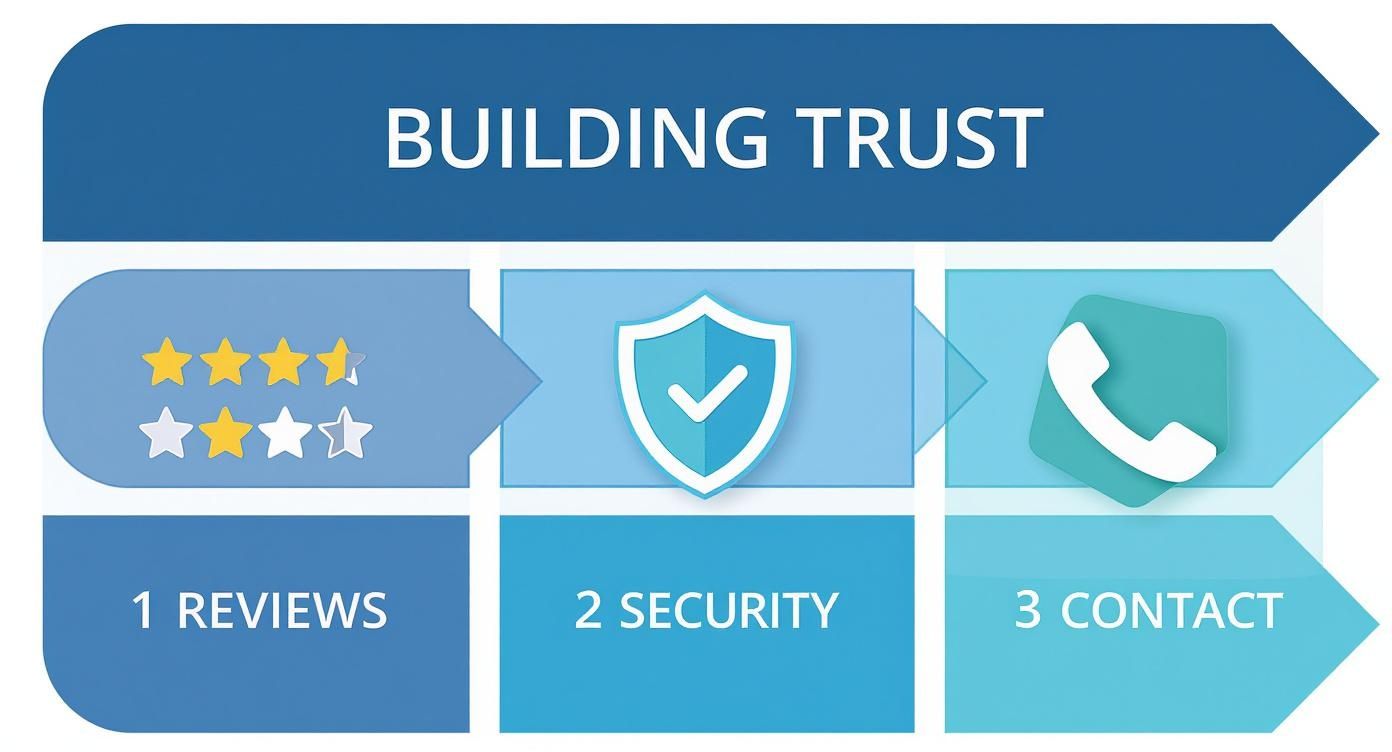
Display Your Authority and Security
Beyond customer stories, you need other signals that tell visitors you’re an established, professional, and secure business. These elements often work on a subconscious level, quietly building a foundation of trust.
Think of these as the digital version of a clean, well-lit storefront. They signal that you take your business, and your customers’ security, seriously. At the end of the day, every conversion tactic relies on understanding how to build brand trust with every single element on your site.
Make sure you have these trust signals in place:
- Security Badges: Display SSL certificates (the little padlock icon) and logos from payment gateways like Visa, Mastercard, or PayPal. Put them in your footer and especially on your checkout pages. These are universally recognized symbols of safety.
- Partner and Client Logos: Have you worked with well-known brands? Show them off! A simple “Trusted By” logo bar on your homepage borrows credibility from companies your visitors already know and respect.
- Easy-to-Find Contact Info: Hiding your contact details is a huge red flag. A visible phone number, physical address, and email prove you’re a real business with real people behind it.
- Professional Design: Don’t underestimate this one. A modern, polished website free of typos and broken links is a powerful trust signal on its own. An outdated design can make even the most legitimate business feel shady.
By weaving these elements of social proof and credibility throughout your website, you start to systematically dismantle a visitor’s natural hesitation. You create a journey where every step is reinforced with validation, turning skeptical browsers into confident buyers.
Creating a Data-Driven Testing Workflow
The biggest breakthroughs in website conversions don’t come from a hunch. They’re uncovered through data. The single most important shift you can make is moving from “I think this will work” to “Let’s test this and find out.” This isn’t about guesswork; it’s about building a systematic workflow for continuous improvement.
Think of it as a feedback loop. You use analytics to spot a problem, form an educated guess on how to fix it, and then run a controlled experiment to see if you were right. This turns your website into a living laboratory where every change is a chance to learn and grow.
From Hypothesis to High-Performing Page
Every great test starts with a solid hypothesis. And a hypothesis is more than just an idea—it’s a clear, testable statement predicting an outcome based on what you’ve observed in your data, heatmaps, or user feedback.
A good hypothesis usually follows a simple formula: If I change [X] for [Y] audience, I expect [Z] to happen because of [reason].
Let’s imagine you notice your pricing page has a terrible bounce rate. You pull up a heatmap and see that almost nobody is scrolling down to the detailed feature comparison table. Bummer.
Here’s a hypothesis you could build from that observation: “If we move the feature comparison table higher up on the page, we expect more users to engage with it and click ‘Sign Up’ because they will finally see the full value of each plan.”
See? It’s specific, you can measure the result, and it has a clear “why” behind it. Without a strong hypothesis, you’re just throwing spaghetti at the wall.
The Power of A/B Testing and User Behavior Tools
A/B testing (or split testing) is the engine of conversion optimization. It’s a simple concept: you pit two versions of a page against each other—the original (Version A) and your new version (Version B)—to see which one converts better.
Your traffic gets split between the two pages, and by tracking the results, you can say for sure whether your change made things better, worse, or had no effect at all. To really dig into the numbers and spot these opportunities, using powerful performance analytics is a game-changer.
But A/B testing only tells you what happened. To form killer hypotheses, you need to understand why it happened. That’s where user behavior tools are invaluable.
- Heatmaps: These give you a visual map of where people are clicking, moving their mouse, and how far they scroll. They’re brilliant for seeing what’s getting attention and what’s being completely ignored.
- Session Replays: Ever wanted to be a fly on the wall? Session replays are anonymous recordings of real user visits. You can literally watch where people get stuck, hesitate, or rage-click in confusion. For a deeper dive, you can explore a whole suite of website visitor tracking tools to get a full picture of the user journey.
This process of testing and validating is how you build trust and drive conversions.
By focusing on things like visible reviews, security badges, and clear contact info—all ideas you can test—you systematically reduce user anxiety and make it easier for them to say “yes.”
Prioritizing Your Testing Ideas
Once you start digging into the data, you’ll have a mountain of testing ideas. The trick is knowing where to start. Not all tests are created equal—some have the potential for massive wins, while others will barely move the needle.
The goal isn’t just to run tests; it’s to run the right tests. Focusing on high-impact, high-confidence ideas first ensures your resources are spent on changes that are most likely to grow your business.
A simple prioritization framework can help you decide what to tackle first. I use one based on three simple factors: potential impact, my confidence in the idea, and how easy it is to implement.
Here’s a simple framework to help you organize your A/B testing ideas and decide what to launch first.
A/B Testing Idea Prioritization Framework
| Test Idea | Potential Impact (1-5) | Confidence (1-5) | Ease (1-5) | Priority Score (Impact+Confidence+Ease) |
|---|---|---|---|---|
| Change CTA from “Submit” to “Get Free Quote” | 4 | 5 | 5 | 14 |
| Redesign the entire homepage layout | 5 | 3 | 1 | 9 |
| Add customer testimonials to the product page | 4 | 4 | 4 | 12 |
| Test a new headline on the pricing page | 3 | 4 | 5 | 12 |
| Remove two non-essential fields from the signup form | 5 | 5 | 3 | 13 |
Using a scoring system like this takes the emotion out of the equation. It forces you to think critically about each idea and focus your efforts where they’ll count the most. This cycle—analyze, hypothesize, test, and prioritize—is how you build a powerful engine for growth that compounds over time.
Answering Your Top Conversion Questions
When you start digging into conversion optimization, a few key questions always pop up. Let’s tackle them head-on, so you can move forward with clarity and confidence.
How Long Until I See a Change?
This is the big one, isn’t it? And the honest-to-goodness answer is: it depends.
If you’re testing a small tweak on a page that gets tons of traffic—say, a new headline or a different button color—you might get statistically significant results from an A/B test in just a few weeks. More eyeballs mean you get your answer faster.
But for bigger projects, like overhauling your entire checkout process or redesigning the homepage, you’re playing a longer game. These initiatives can easily take several months to plan, build, and measure properly. The trick is to stop thinking of this as a one-and-done fix. It’s a continuous cycle of improvement.
What’s a “Good” Conversion Rate Anyway?
It’s easy to get hung up on finding that one magic number, but a “good” conversion rate is completely relative. What’s fantastic for one business might be a total flop for another.
Several things change the definition of “good”:
- Your Industry: A retail e-commerce site might be thrilled with a 2-3% conversion rate, but a B2B software company could see 10% on a free guide download as a massive win.
- The Goal: It’s way easier to get someone to sign up for a newsletter than it is to get them to buy a $5,000 product. The goal dictates the expected rate.
- Where Traffic Comes From: Someone clicking through from a targeted email is usually much warmer and more likely to convert than a person who just landed on your site from a random social media ad.
While the average conversion rate across the board is around 2.35%, don’t get fixated on it. Your real competition is your past performance. Aim for steady, month-over-month growth.
The most important benchmark is your own. Focus on beating your numbers from last month. That’s how you know you’re on the right track and truly learning what your audience wants.
Should I Focus on More Traffic or More Conversions?
Ah, the classic dilemma. For almost everyone, the answer is clear: focus on conversions first.
Think of it this way: driving a flood of new visitors to a website that doesn’t convert well is like pouring water into a bucket full of holes. You’re just wasting time, money, and potential customers. It’s an exhausting and expensive way to try and grow.
First, you need to plug those leaks. Improve the user experience, make your messaging crystal clear, and build trust signals. By doing this, you squeeze every bit of value out of the traffic you’re already getting. Suddenly, every marketing dollar you spend becomes more powerful.
Once you’ve turned your website into a smooth-running conversion engine, then it’s time to open the traffic floodgates. Every new visitor becomes exponentially more valuable, giving you a much better return on your investment from SEO, paid ads, and content marketing. You stop paying for clicks that go nowhere and start building a real, sustainable path to growth.
Ready to stop losing leads and start converting more of your hard-earned traffic? LeadBlaze is a 24/7 AI sales assistant that engages every visitor, answers their questions, and qualifies leads for you—day or night. Turn your website into your best salesperson. Start your free trial at https://leadblaze.ai.